


Red Alert: 8 Projects Where Crimson Commands Attention
Architects: Want to have your project featured? Showcase your work by uploading projects to Architizer and sign up for our inspirational newsletters.
When it comes to red, one thing is certain: it has never been a shy color. Across cultures, it signals everything from luck and celebration to passion, danger and revolution. In China, it’s tied to prosperity; in India, to marriage and new beginnings; and in the West, it can mean love or danger. But whatever the context, this bold color never fails to take the spotlight.
In architecture, the shade can flip a space from background to center stage, turning a stair, wall or façade into the main event. These eight projects show how red, whether as a bold accent or a full façade, can define the entire character of a building.
Big Red Crayfish
By Dayi Design, China
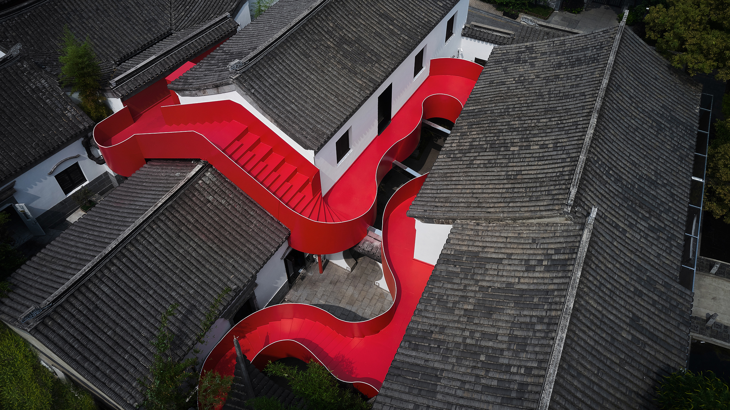
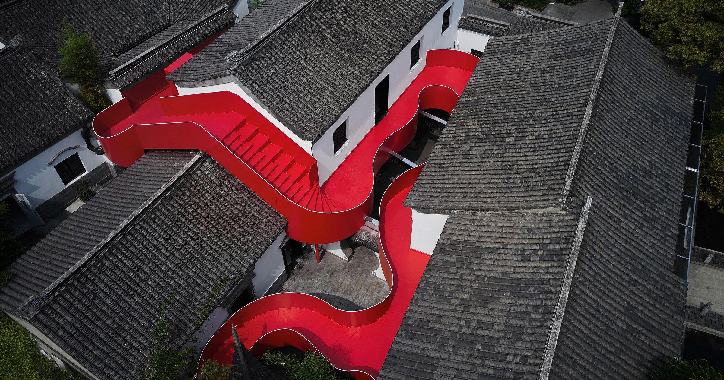
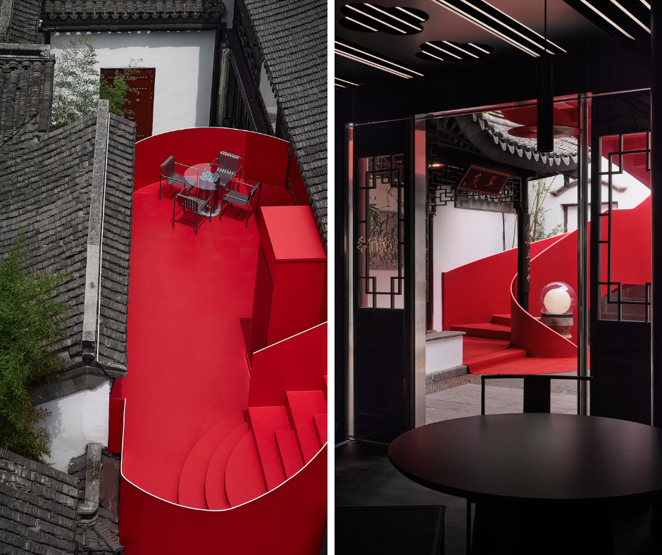 Located along Nanjing’s Qinhuai River, this renovation adapts a historic site into a crayfish-themed dining and commercial destination. The project preserves the character of the old structures while introducing bold steel staircases that connect multiple floors. Finished in Chinese red, the staircases stand out against the muted tones of the surrounding architecture and tie directly to the theme of the “Big Red Crayfish.” Their flowing forms cut across the complex, linking once-isolated spaces and guiding visitors through the site. Beyond circulation, the staircases create new perspectives of the river and nearby temple, while their striking color has turned them into a popular landmark, helping to draw people in and support the site’s cultural and commercial renewal.
Besa Museum
By Oppenheim Architecture, Tirana, Albania
Jury Winner, 13th Annual A+Awards, Unbuilt Cultural
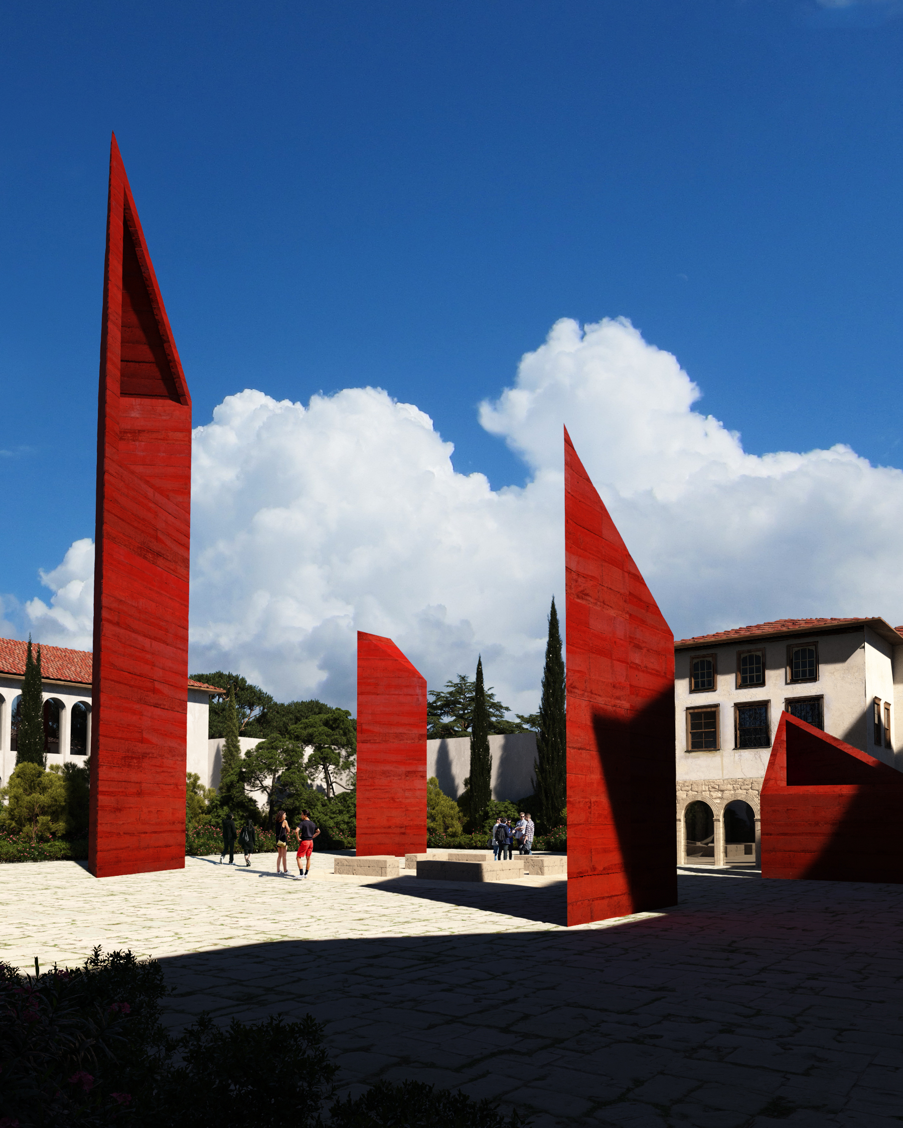
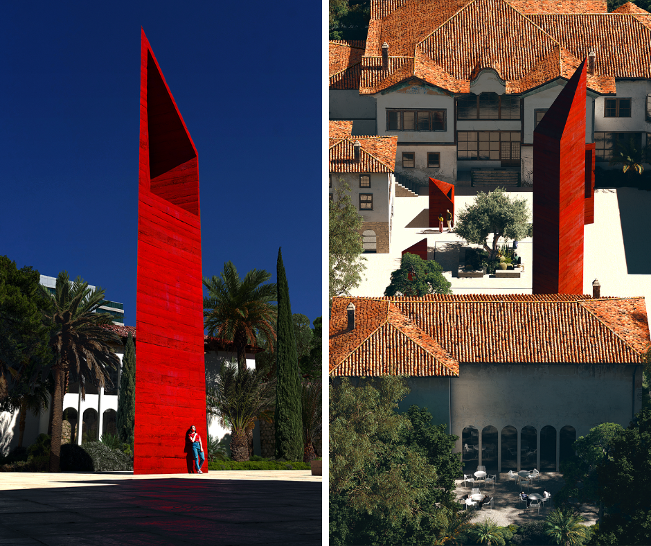 The Toptani Residence in Tirana has been restored and transformed into a museum dedicated to the Albanian principle of Besa, a code of honor rooted in promise and protection. Designed for both locals and visitors, the project preserves the historic fabric of the house while introducing a new underground extension. Four shafts of natural light cut through the courtyard, each representing the “Pillars of Besa”: Tradition, Protection, Hospitality, and Honor. Inside, interactive exhibits immerse visitors in these values, while the restored architecture highlights Albania’s cultural legacy. The use of strong red tones throughout the design underscores the gravity of Besa, reinforcing its role as both a national identity and a moral compass for future generations.
Nozhan Residential Apartment
By MAAN Architecture Office, Shiraz, Iran
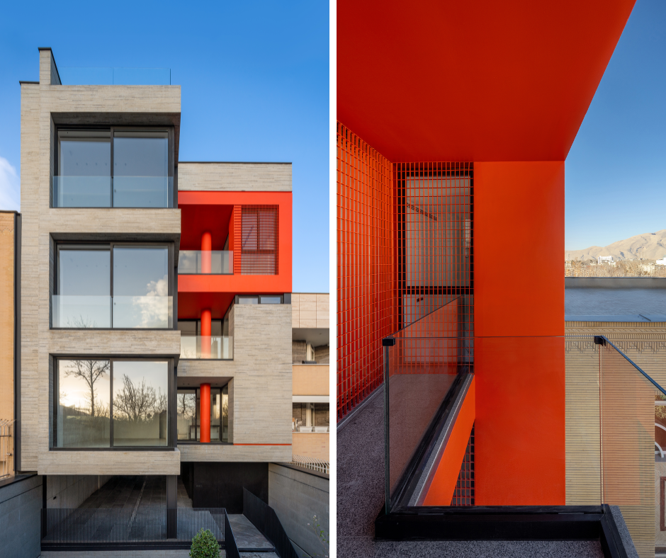
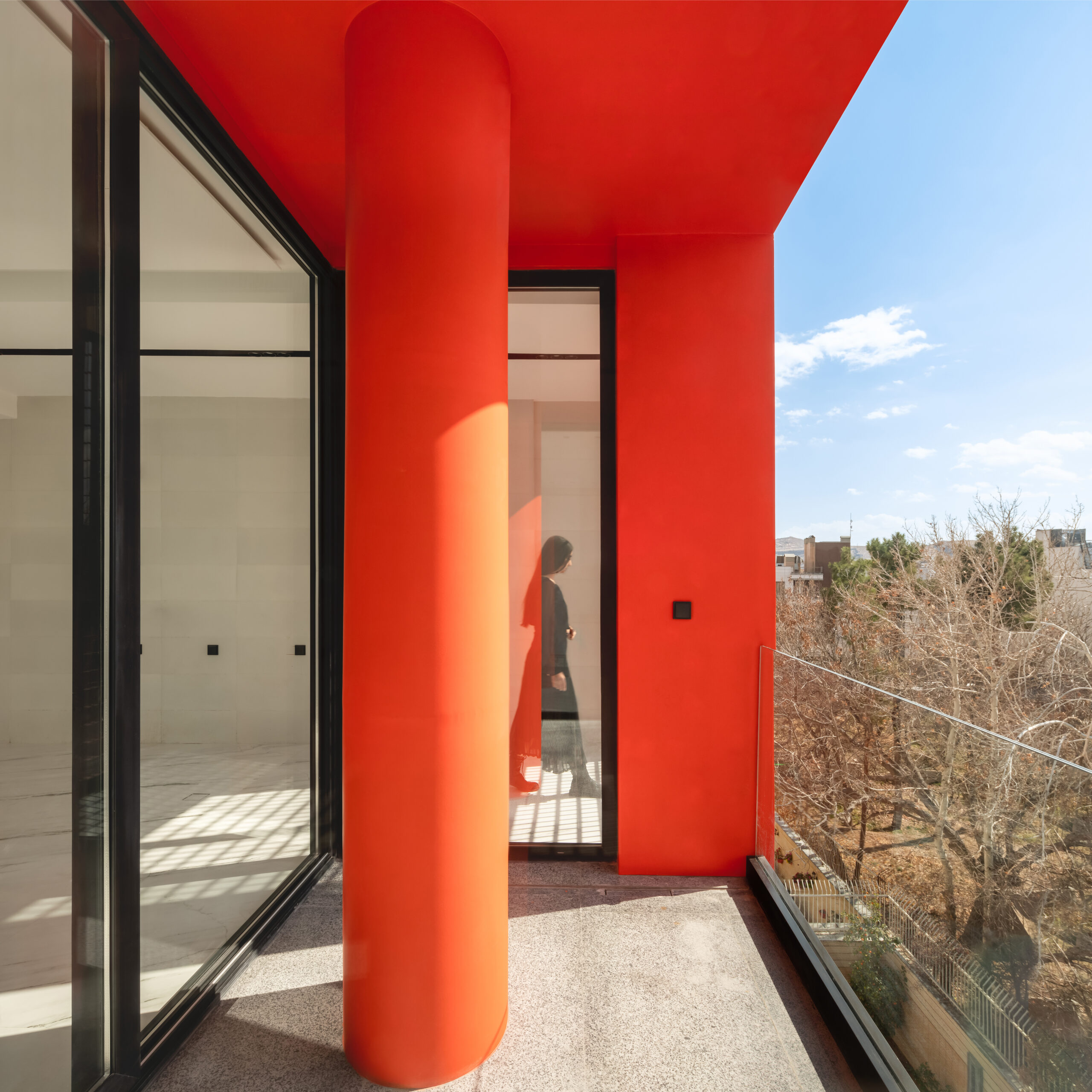 Set at the end of a narrow alley in Shiraz, the Nozhan Residential Apartment challenges the limitations of a back plot through bold material choices. The building’s façade is constructed from recycled stone offcuts, turning industrial waste into a defining architectural surface. Alongside this heavy material presence, strong red accents break up the mass, shifting parts of the structure toward abstraction. This dual strategy creates both weight and lightness, making the project stand apart from its surroundings. For residents, the design provides a sense of character and identity in a typically overlooked site, proving how color and material together can transform modest conditions into a distinctive urban landmark.
Somesome Southeast Asian Restaurant
By Beijing Jimei Survey and Design, Beijing, China
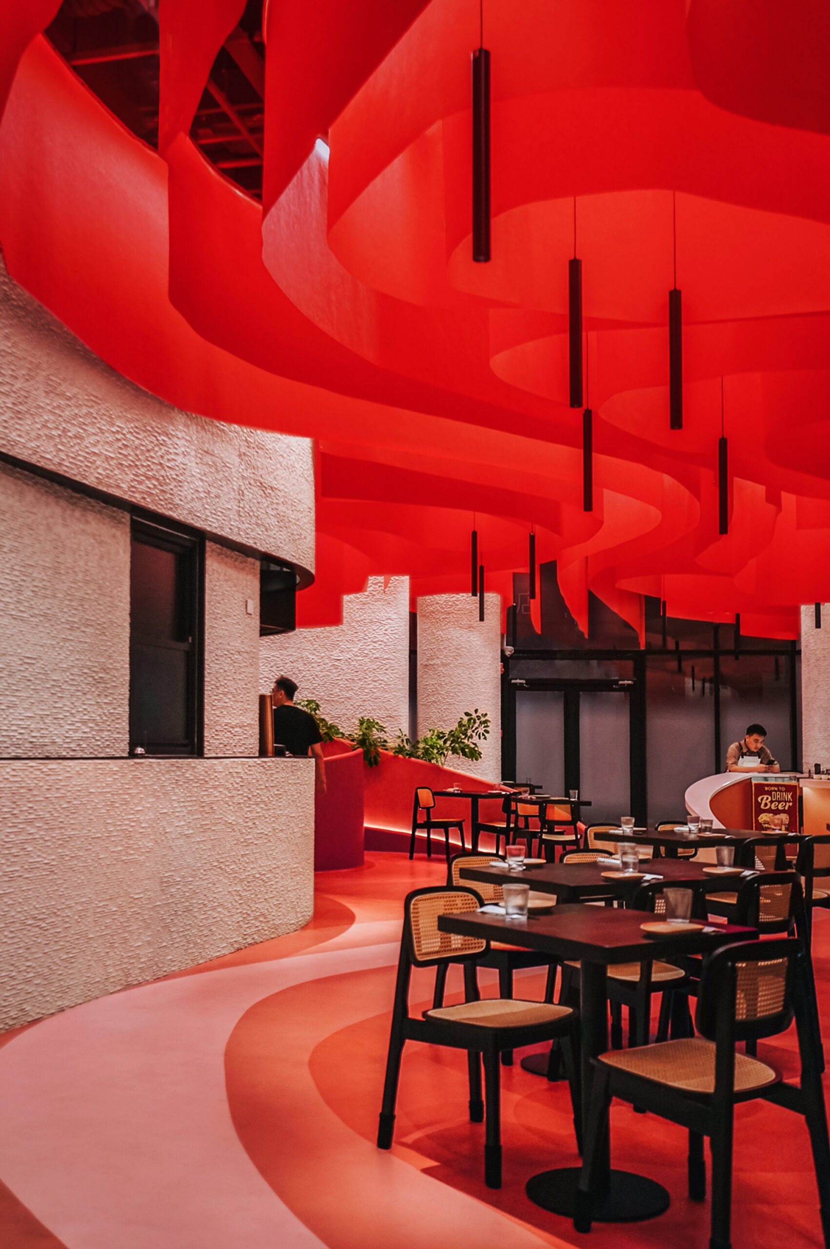 This restaurant in Beijing is designed as a flowing interior landscape, shaped by movement, social interaction and the rhythms of dining. Using digital simulations of pedestrian traffic, the architects created a layout without rigid lines, where tables sit like islands within a continuous floor pattern. Across this setting, red defines the atmosphere. Applied in gradients that spread across walls and ceilings, the color suggests the motion of paint dissolving in water. It draws guests into a warm, immersive space that feels both energetic and intimate. By tying circulation, seating, and ambiance together, the red palette transforms the restaurant into an environment that amplifies both dining and gathering.
Red Sol Resort
By Bofill Taller de Arquitectura, Dhërmi, Albania
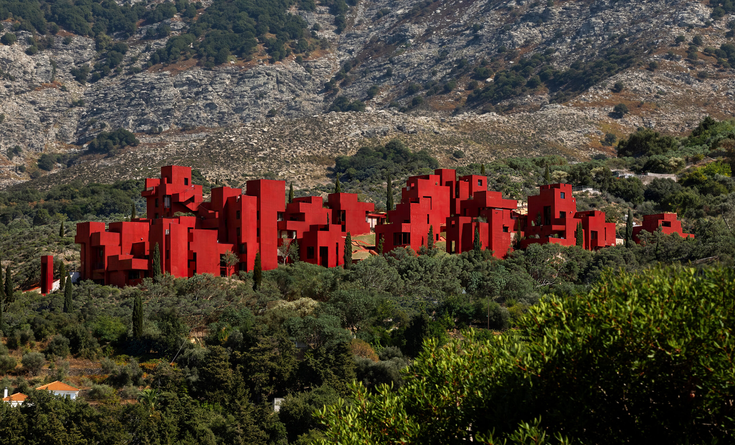
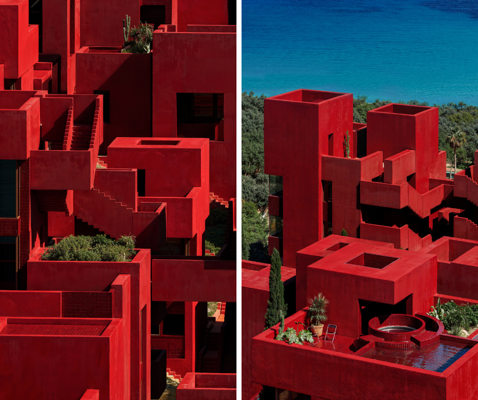 Set on the rocky slopes of the Albanian Riviera, Red Sol Resort organizes a steep, rugged site into a structured grid of villas. Each unit is arranged as a square, shifting in height to follow the terrain and open views of the sea. Private courtyards and rooftop pools give residents intimacy, while a network of stairs, bridges, and patios connects the villas into a shared community. Finished in striking red, the architecture recalls the Taller’s iconic La Muralla Roja and references the historic kasbahs of North Africa. The color anchors the complex in the landscape, giving the resort a strong identity while turning it into a landmark on the coastal horizon.
Zuidplein Theater
By Studio RAP, Rotterdam, Netherlands
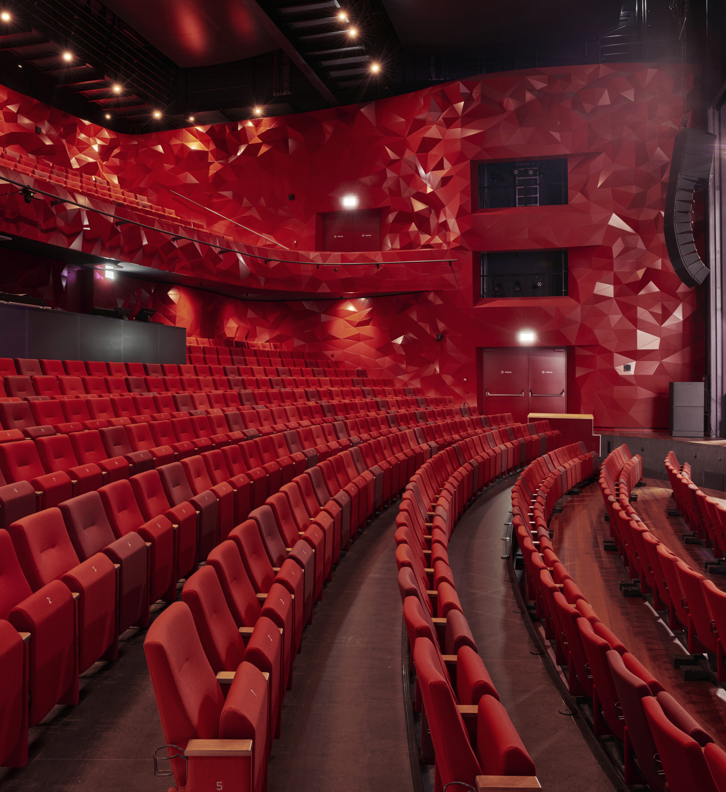
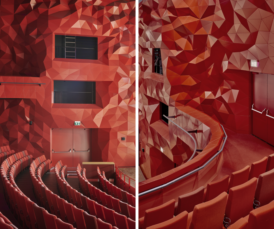 In Rotterdam, Studio RAP designed the striking interior of the Zuidplein Theater’s main hall. Commissioned by the City of Rotterdam under a strict budget and timeline, the project uses digital algorithms to generate a rippling surface of 6,000 unique aluminum-composite panels. The result is a fluid wall system that shapes the acoustics of the auditorium while surrounding audiences in a continuous wave-like form. Bright shades of red were chosen to heighten the drama of the space, making the hall both visually and acoustically unforgettable. The bold color reinforces the theater’s role as a place of performance, ensuring the audience’s experience is as powerful to the eye as it is to the ear.
The Learning Center at Quest
By KSM Architecture, Chennai, India
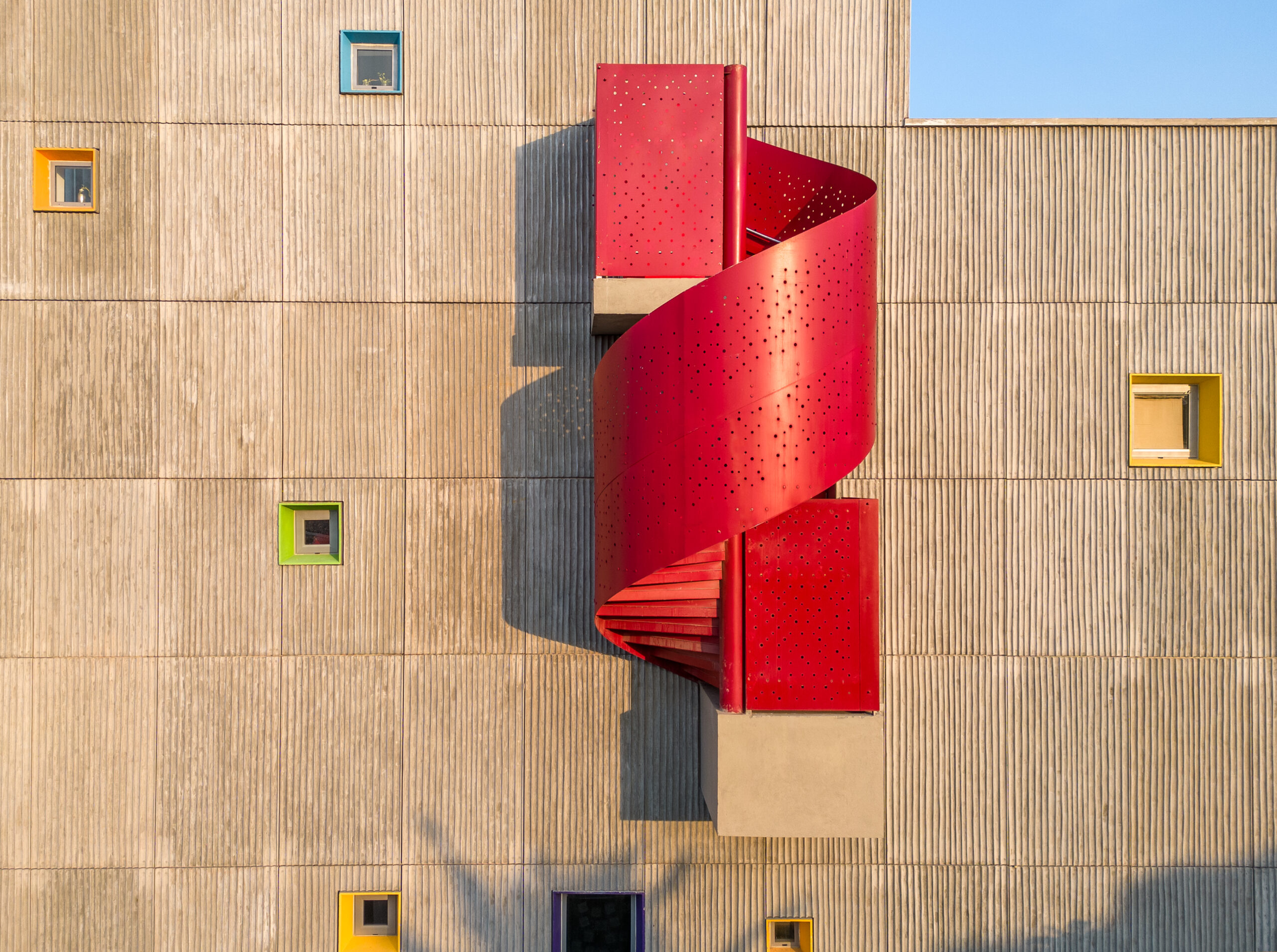
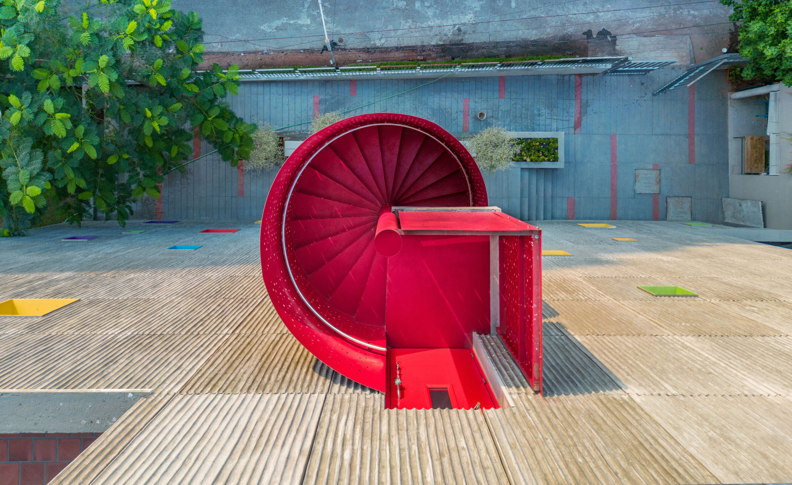 Built for children in homeschooling and unschooling programs, the Learning Center at Quest is designed as a place for curiosity-led education. A tall atrium connects stacked classrooms, library spaces, and a rooftop cafeteria, with movement guided by a striking spiral stair that bursts from the façade in bright red. Inside, the same bold color reappears in staircases and doors, adding rhythm and energy to the raw concrete shell. The red accents stand out among other playful details, like colored window frames and murals, and help give the building its identity. In a setting shaped by air, light, and openness, these flashes of red reinforce the school’s focus on interaction, exploration, and joy in learning.
Taller Estudio Daniela Riquelme
By AMASA Estudio, Andrea López + Agustín Pereyra, Mexico City, Mexico
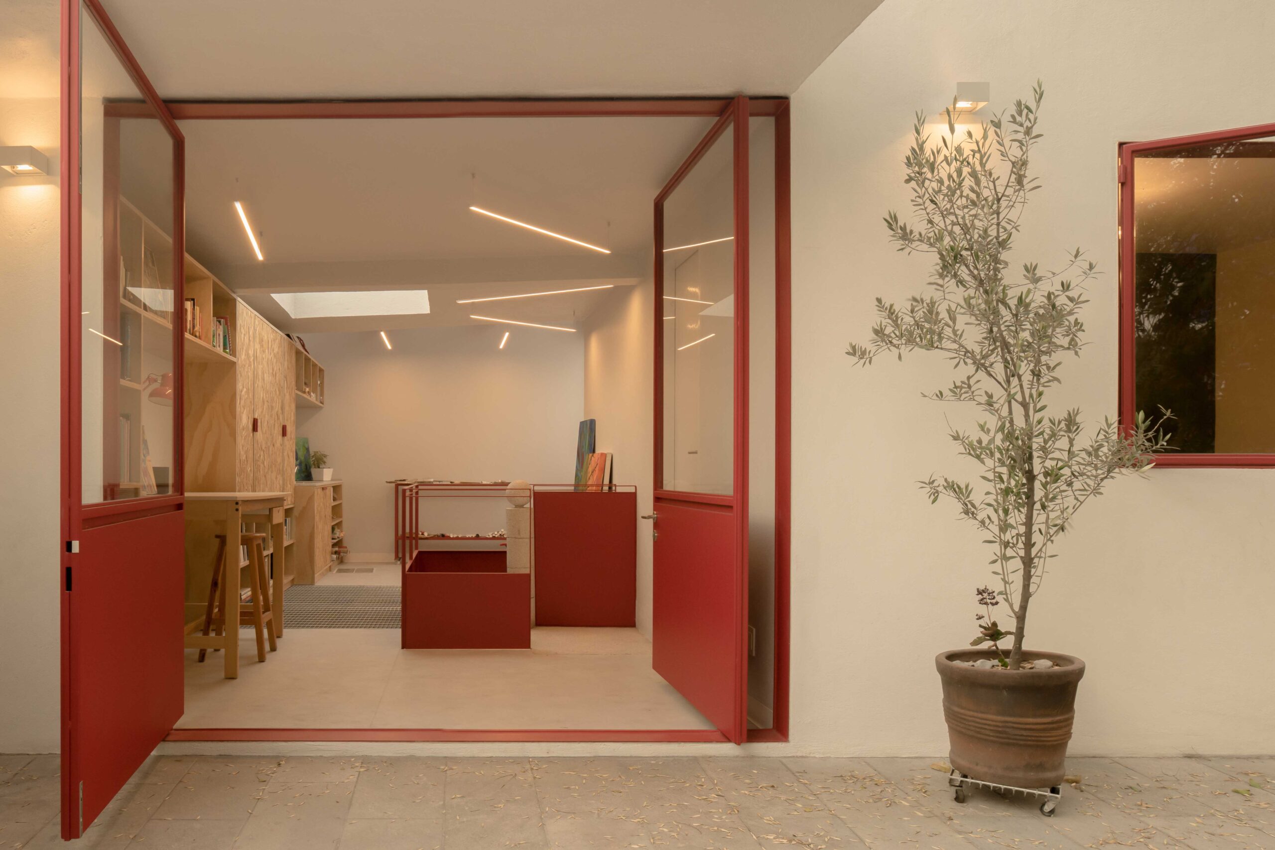
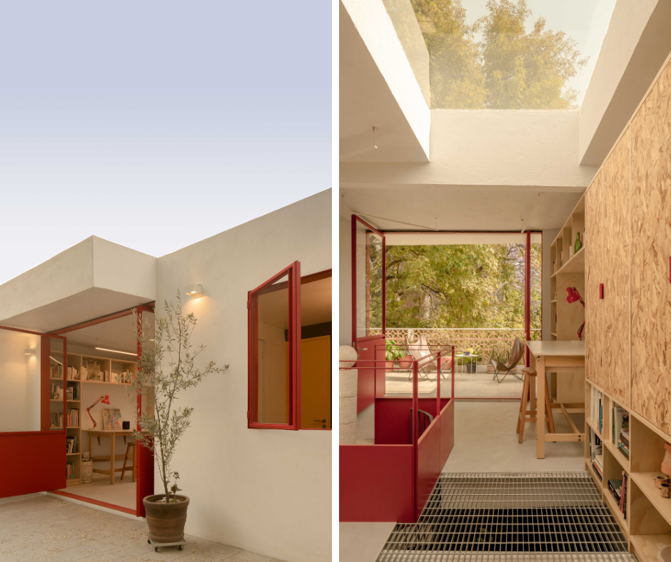 In Coyoacán, the renovation of artist Daniela Riquelme’s home expands the upper floor into a light-filled studio and workshop. The transformation introduces custom carpentry, a sawtooth roof, and generous openings to support painting, jewelry-making, and exhibition. A preexisting spiral stair anchors the layout, with a skylight above that draws light deep into the house. Across the interior and exterior, garnet red ironwork frames doors, windows, and railings. The color provides a strong counterpoint to pale walls and wood, while reflecting the artist’s own palette. These accents give rhythm to the space, highlight moments of transition, and tie the studio’s identity directly to Riquelme’s creative practice.
Architects: Want to have your project featured? Showcase your work by uploading projects to Architizer and sign up for our inspirational newsletters.
The post Red Alert: 8 Projects Where Crimson Commands Attention appeared first on Journal.