


Beyond the Logo: 7 Projects Where Identity Speaks Through Design
The latest edition of “Architizer: The World’s Best Architecture” — a stunning, hardbound book celebrating the most inspiring contemporary architecture from around the globe — is now available for pre-order. Secure your copy today.
Brands usually express their identity through logos, typography or visual campaigns, but they show it most powerfully when they embed it in the design of the building that houses their operations. Architecture gives form to values and makes identity visible long before a sign comes into view.
I notice this in everyday life. In Nigeria, HMedix stores show themselves with distinctive curtain walls and lighting, GTBank stands out with its bright orange cubes, and Chicken Republic announces itself with its unmistakable yellow and red palette. These buildings tell their brand without necessarily needing a sign. You know where you are just by the way the place looks and, in some cases, feels.
This same idea plays out globally. Companies and institutions are finding ways to include their visual language in the design of their structures. Whether it’s the curve of a roof or the finish of a staircase, design choices can be as telling as a logo. When those choices carry the same clarity as a name or a color, a space begins to express the brand on its own.
From a wine cellar in Spain to a glowing white shop in China, the following projects show how identity can live in form, material, and layout. They prove that the most powerful brands are the ones you recognize before a single word comes into view.
White Is Good Shop in Weipo
By designRESERVE, Weipo, China
Jury Winner, Showrooms, 13th Architizer A+Awards
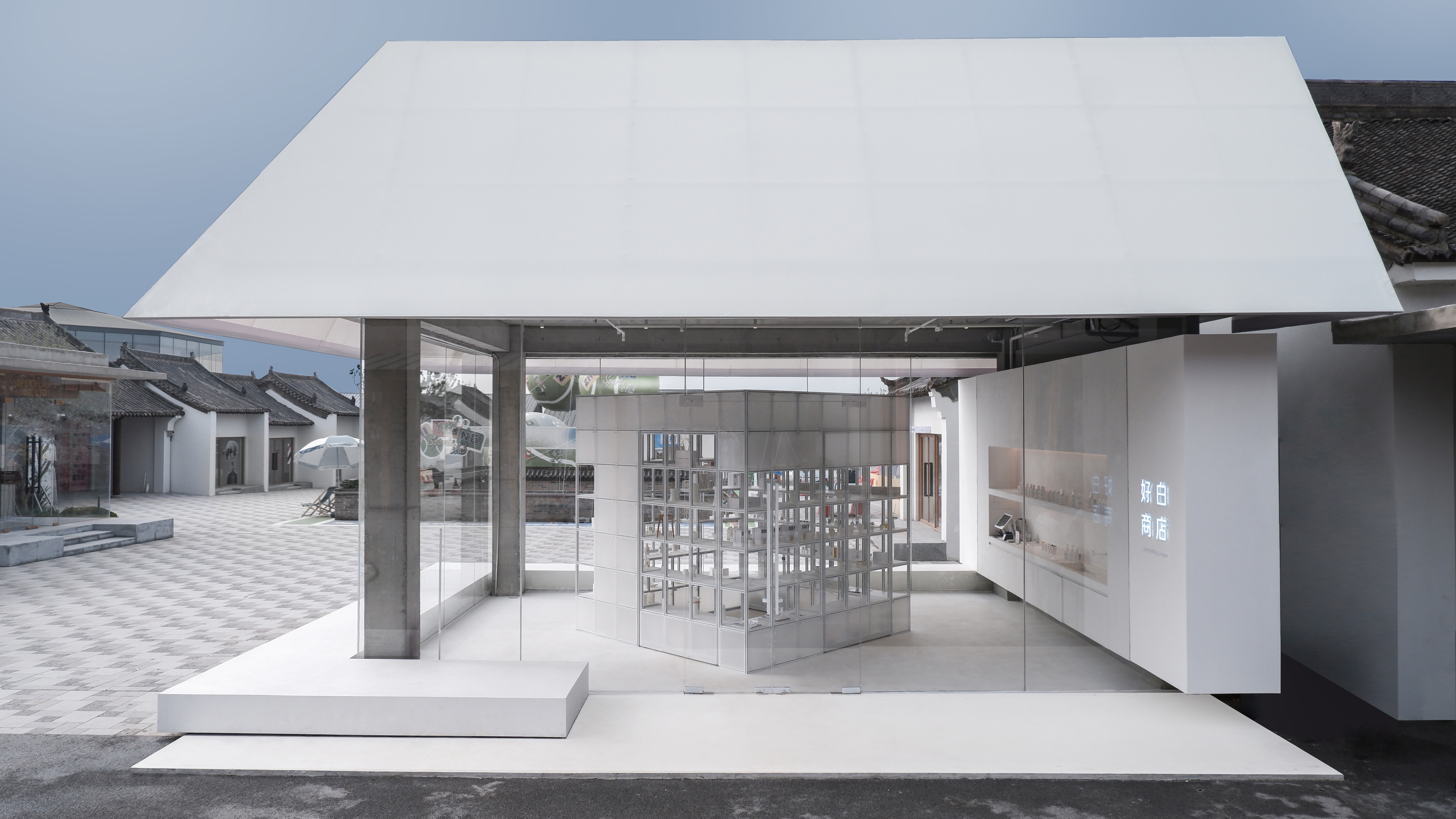
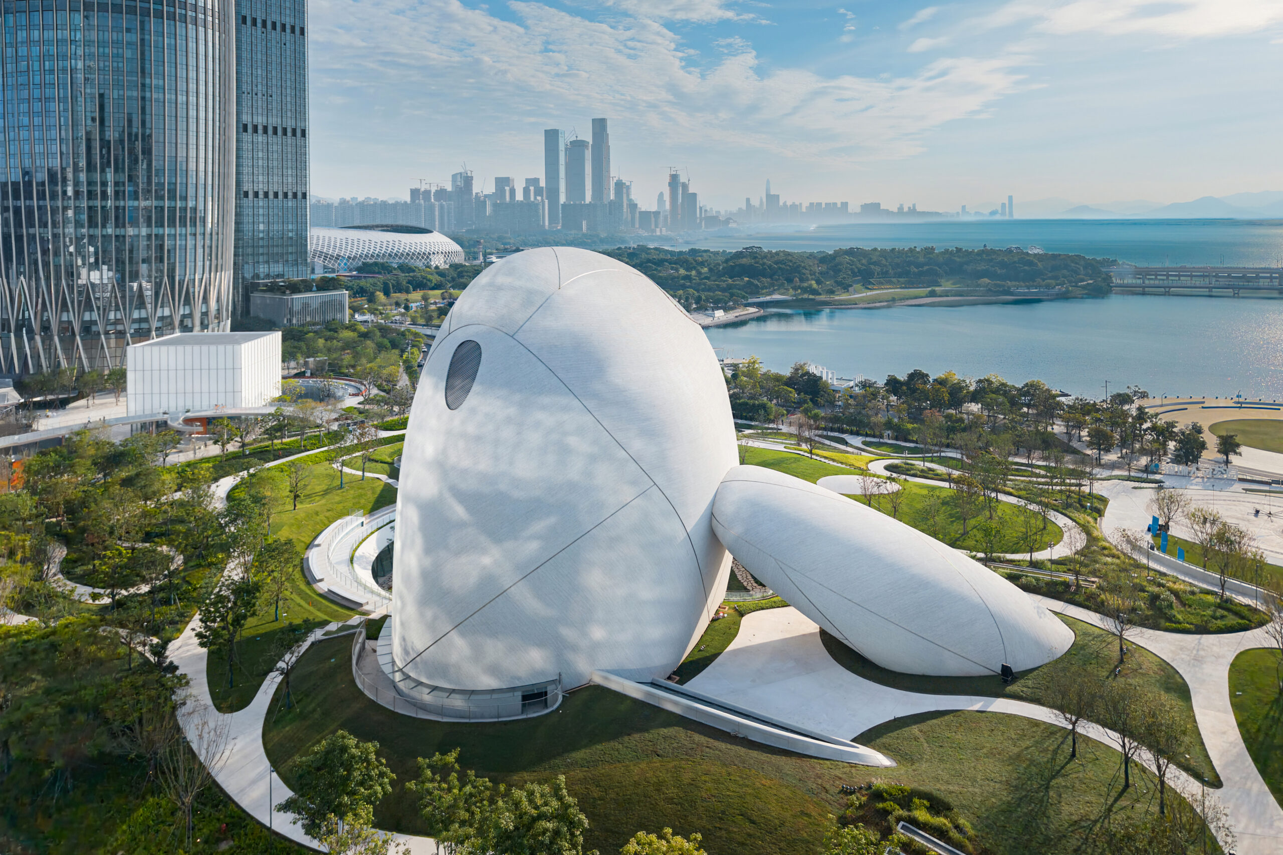
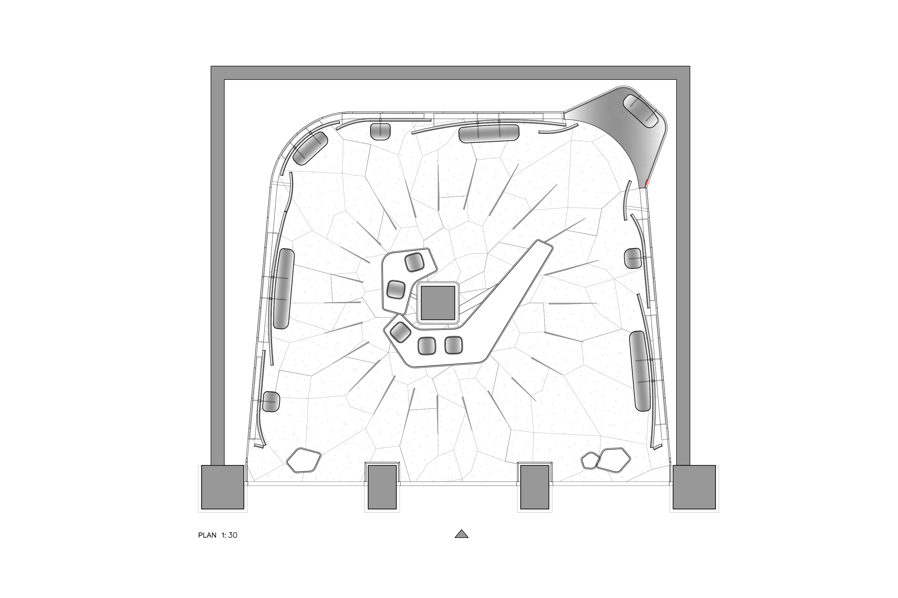
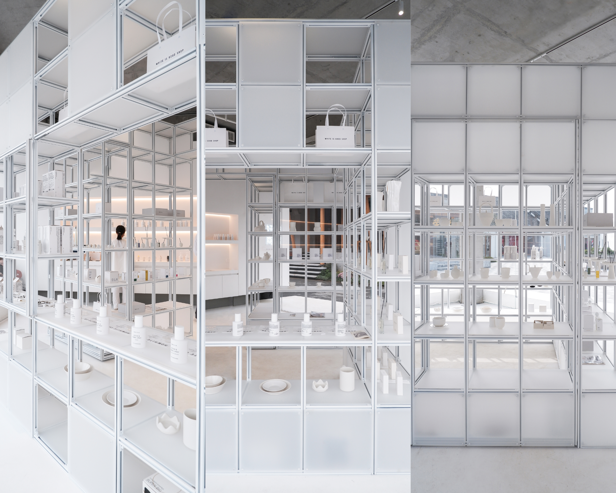 White Is Good Shop makes its brand visible in the simplest way possible: through whiteness. designRESERVE designed the store as a glowing lantern with a pitched polycarbonate roof that shines day and night. Inside, every surface reinforces the brand identity with concrete floors, fabric walls and plexiglass shelving that all shift subtly between shades of white. A modular frame of aluminum and plexiglass holds the displays, keeping the structure clear and functional. Without a logo, visitors know they are in White Is Good. The architecture itself delivers the brand’s promise of clarity and simplicity.
Overland Headquarters Showroom for the New Earthism Series
By AD ARCHITECTURE, Foshan, China
Jury Winner, Architecture +Branding, 13th Architizer A+Awards
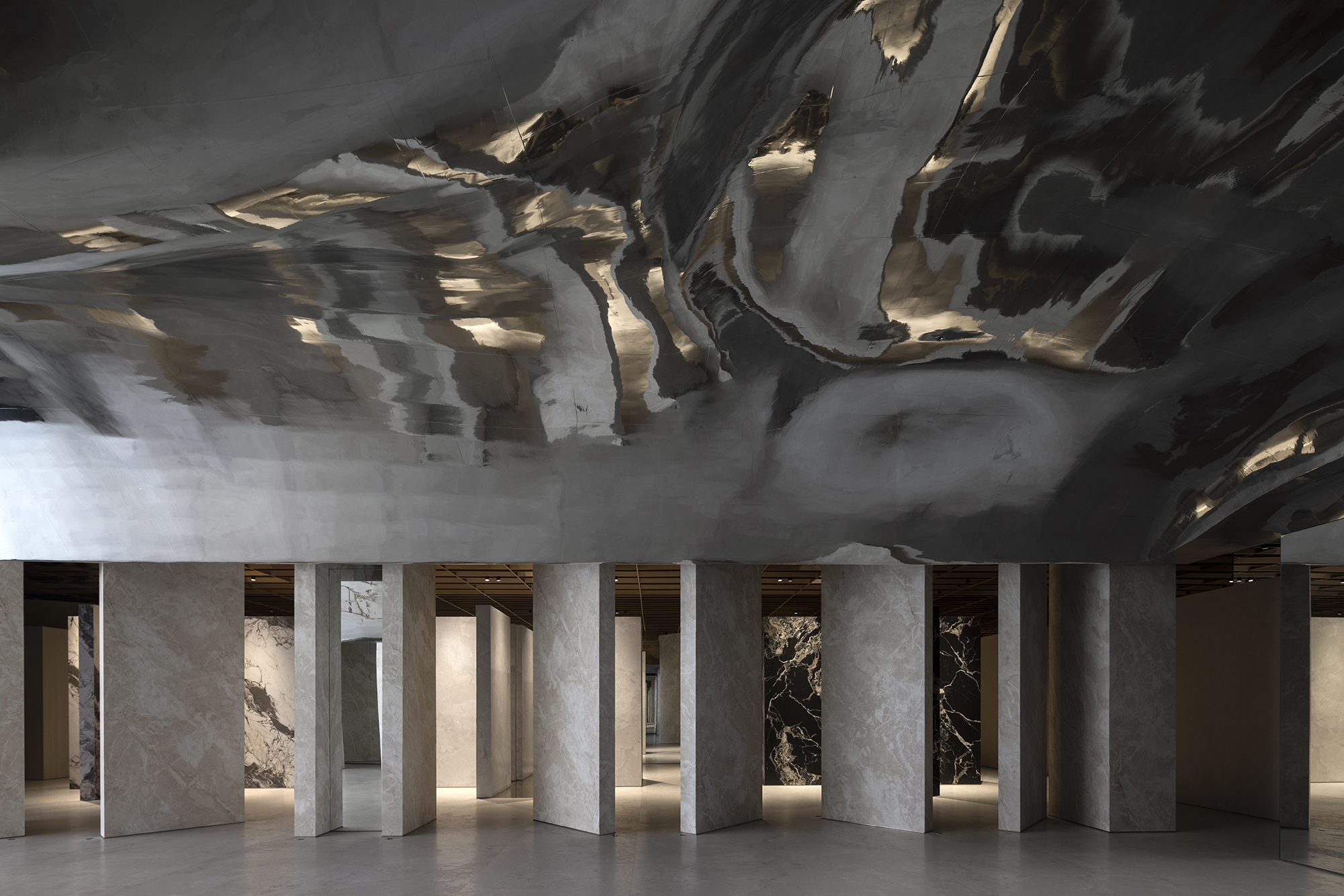 AD ARCHITECTURE staged the space like a runway, placing the company’s Earthism Series tiles at the center of attention as if they were fashion pieces. This way, the walls, floors, and ceilings become frames for the product, while mirrors and glowing partitions create a sense of drama. The earthy tones and natural light on the inside tie back to the philosophy of “Earthism,” presenting the tiles as both material and lifestyle. The experience created by the designers is one where architecture makes Overland’s identity visible.
HumCustom Factory Exhibition Hall
By OAOA Studio, Hangzhou, China
Popular Choice Winner, Showrooms, 13th Architizer A+Awards
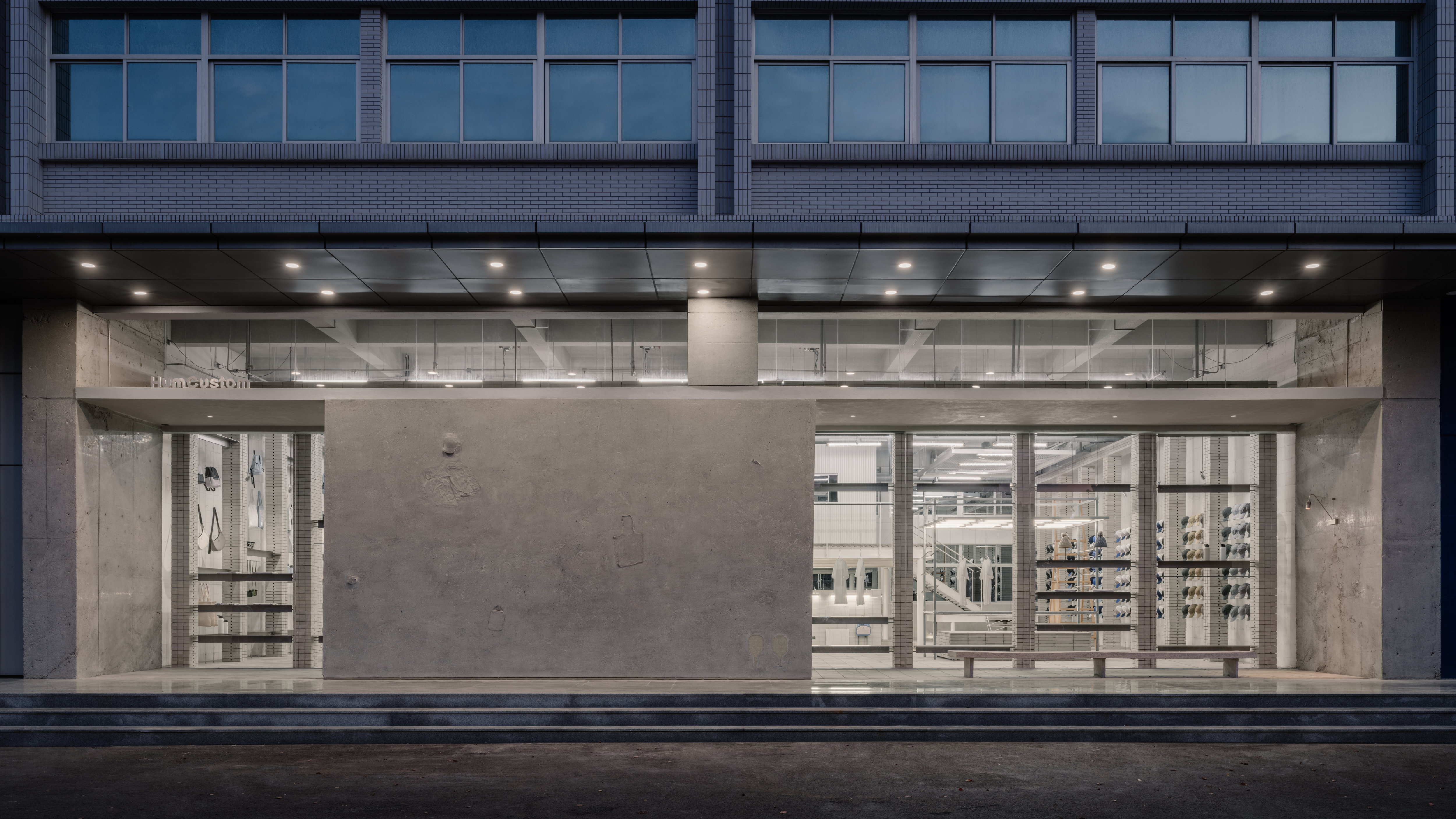
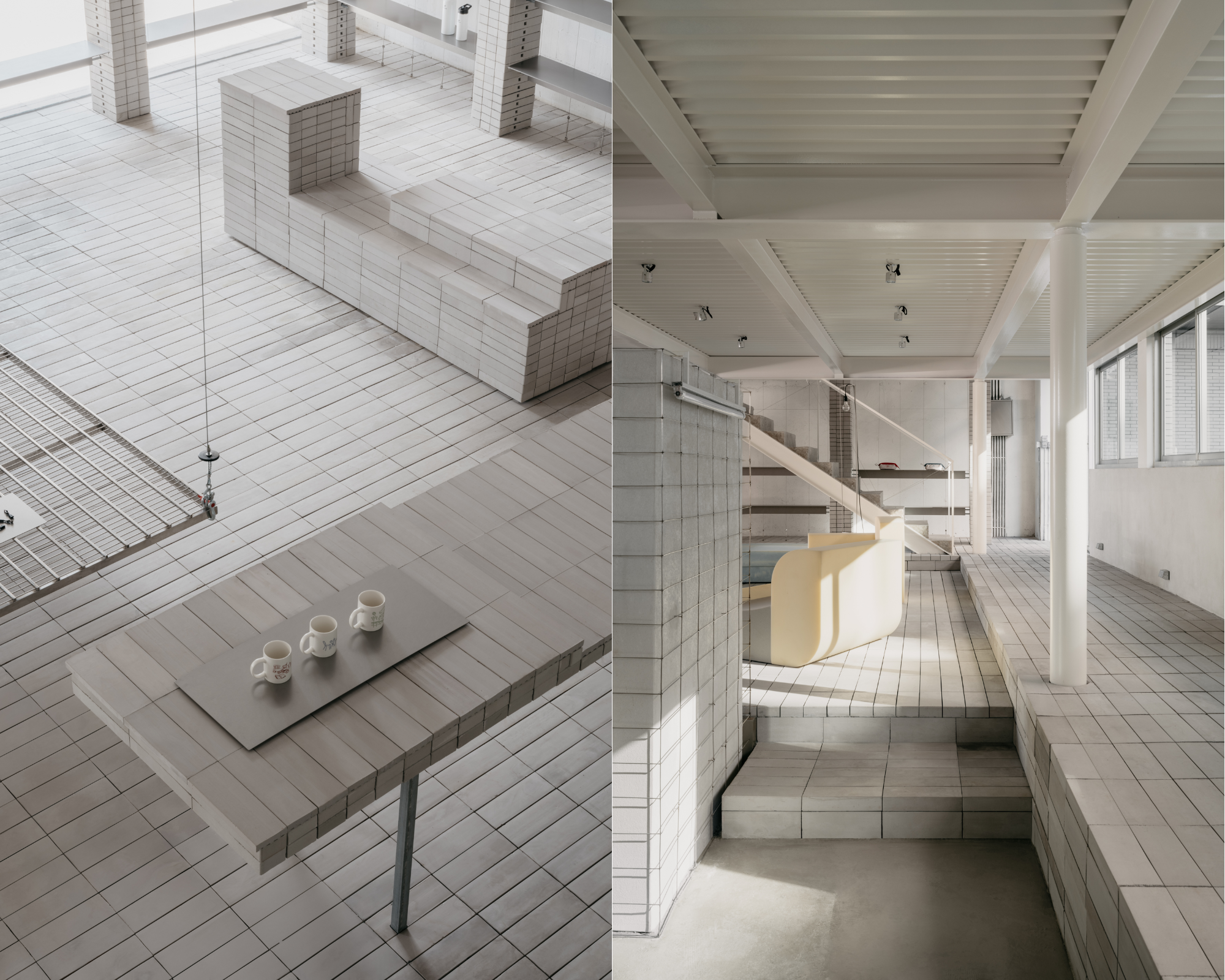 HumCustom’s exhibition hall turns its brand philosophy into architecture. OAOA Studio imprinted the concrete façade with outlines of hats, mugs and tote bags, the blank products the company customizes. Visitors know what the brand does before they even step inside. The interior carries the same idea with raw steel frames, concrete benches, and sponge blocks that feel like base materials waiting to be transformed. The path through the building also tells a story. A narrow entry corridor leads into the main hall like a reveal from blank base to finished good. The structure shows its brand identity like a giant sample. It communicates the fact that HumCustom is defined by flexibility and customization.
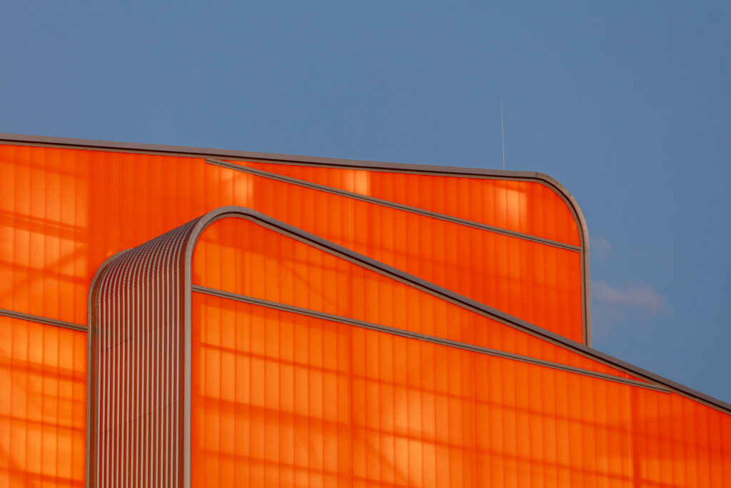
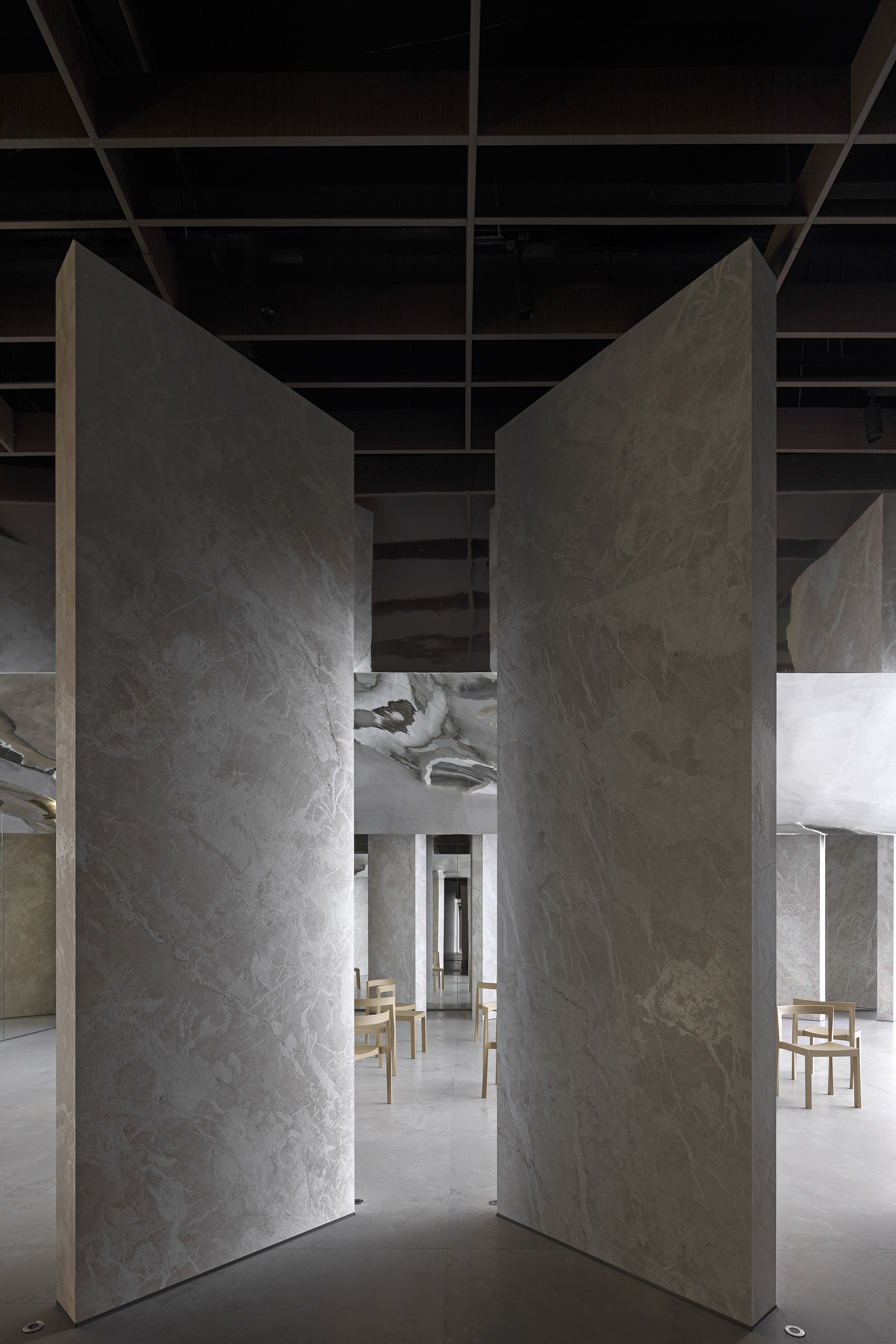
The Realm of Cognac – Hennessy Store
By MO Studio, Ningbo, China
Popular Choice Winner, Architecture +Branding, 13th Architizer A+Awards
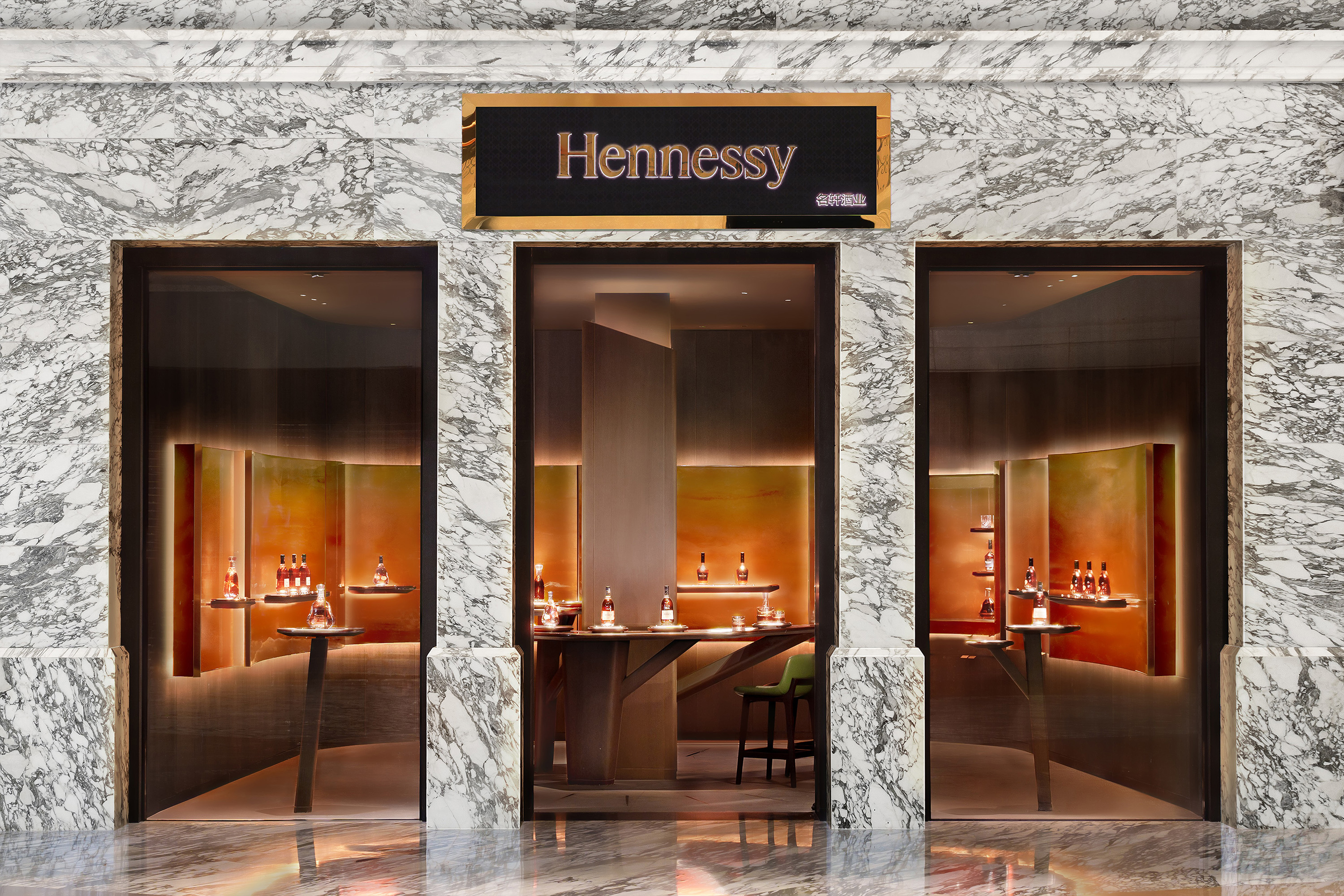
 The Hennessy boutique in Ningbo feels like the inside of a glass of cognac. MO Studio used amber resin panels that glow like liquid fire to wrap the room in warmth. From outside, the three window bays frame the scene like three filled glasses and turn the façade into an abstract toast. Inside, they made a column at the centre of the space shaped like a grapevine, which flows down into twenty-four brass inlays on the floor arranged like the hands of a clock. This detail represents the time required for the drink itself to mature. Feeling the brand more than seeing it was MO Studio’s clear goal with this project.
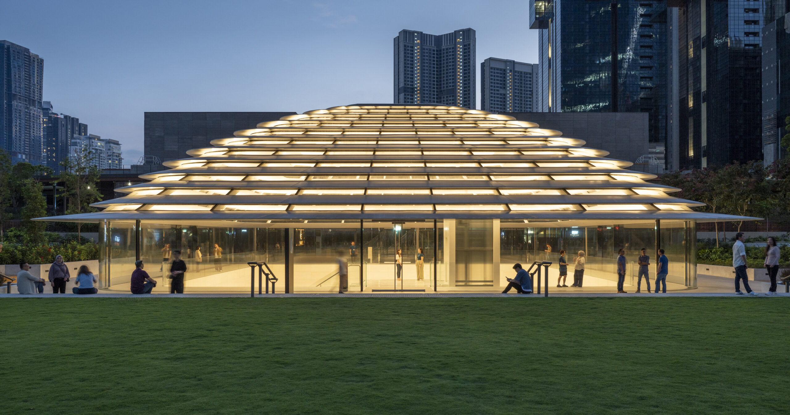
Apple The Exchange TRX
By Foster + Partners, Kuala Lumpur, Malaysia
Jury Winner, Retail, 13th Architizer A+Awards
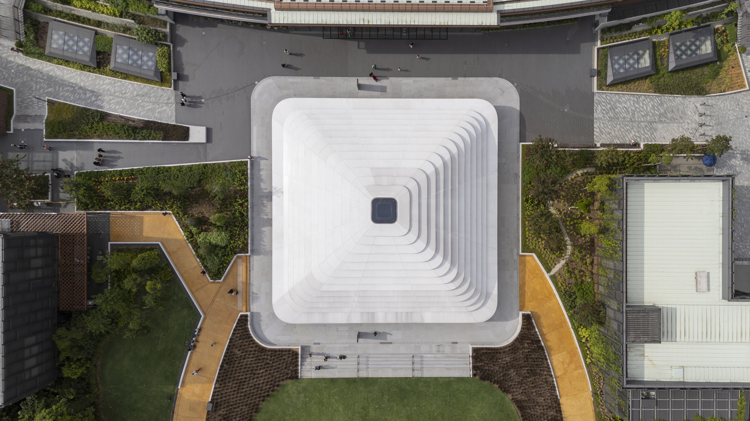
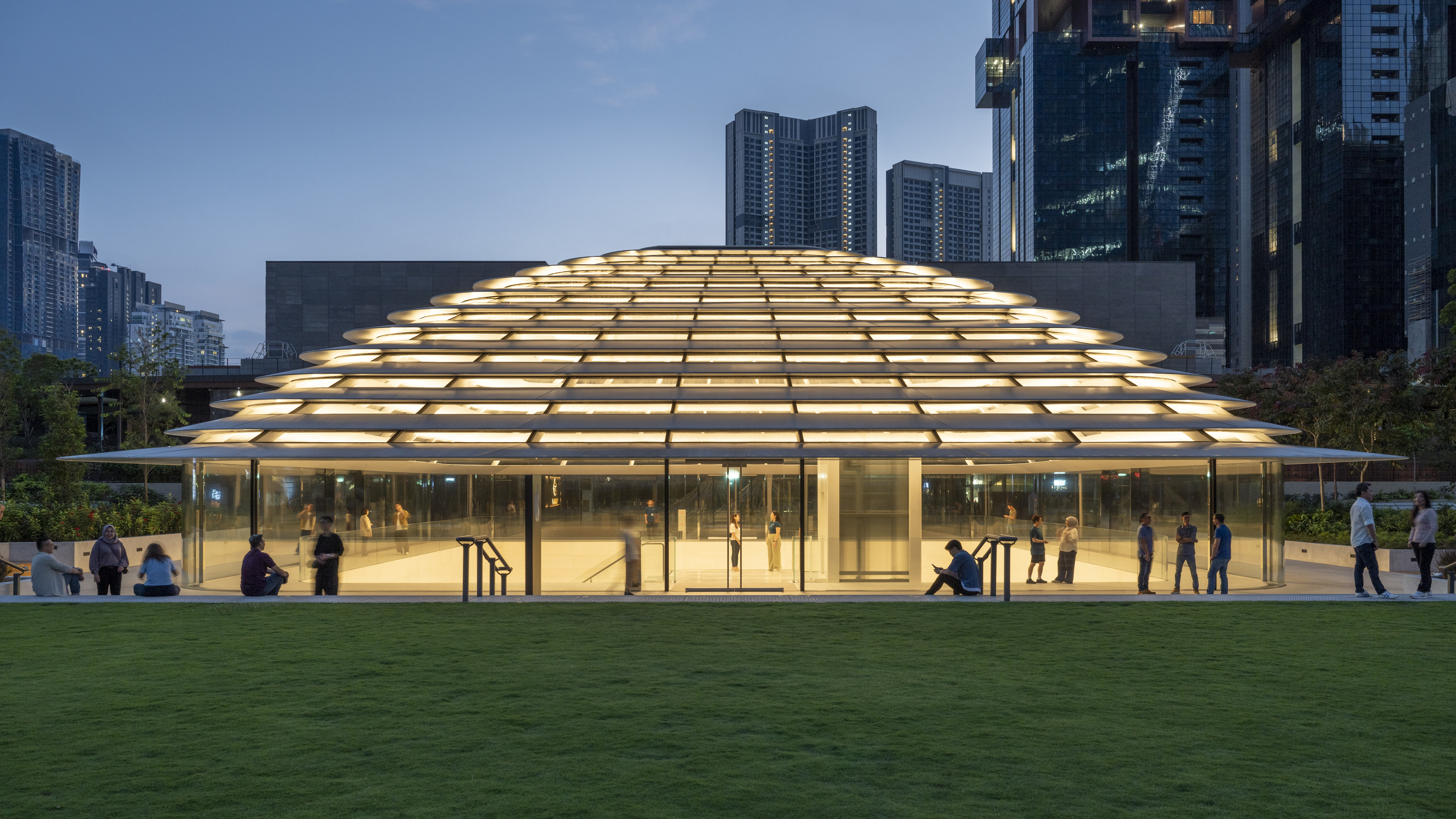 Foster + Partners designed Apple’s first store in Malaysia to read less like a shop and more like a physical extension of the brand’s design language. The domed roof brings the soft curvature of an iPhone to mind, while the use of stainless steel, stone and glass mimics the finish of its devices. Inside, light is filtered and controlled with the same meticulous care that goes into the design of an apple screen. Without a logo in sight, you would look at the building and think to yourself: “Yeah, this is definitely giving Apple.”
Tianjin Zhongshuge Bookstore
By X+LIVING, Tianjin, China
Jury Winner, Commercial Interiors (<25,000 sq ft), 13th Architizer A+Awards
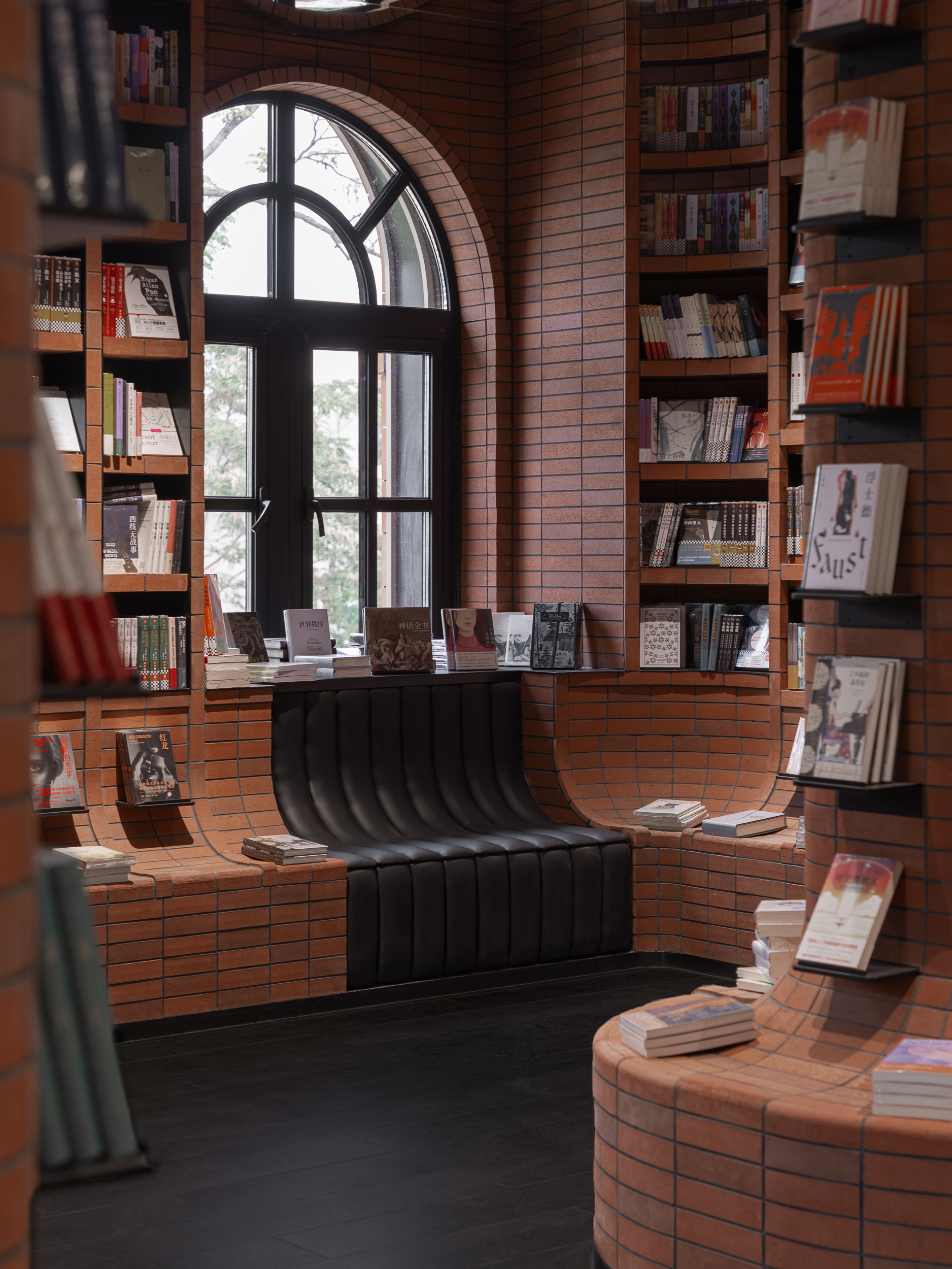
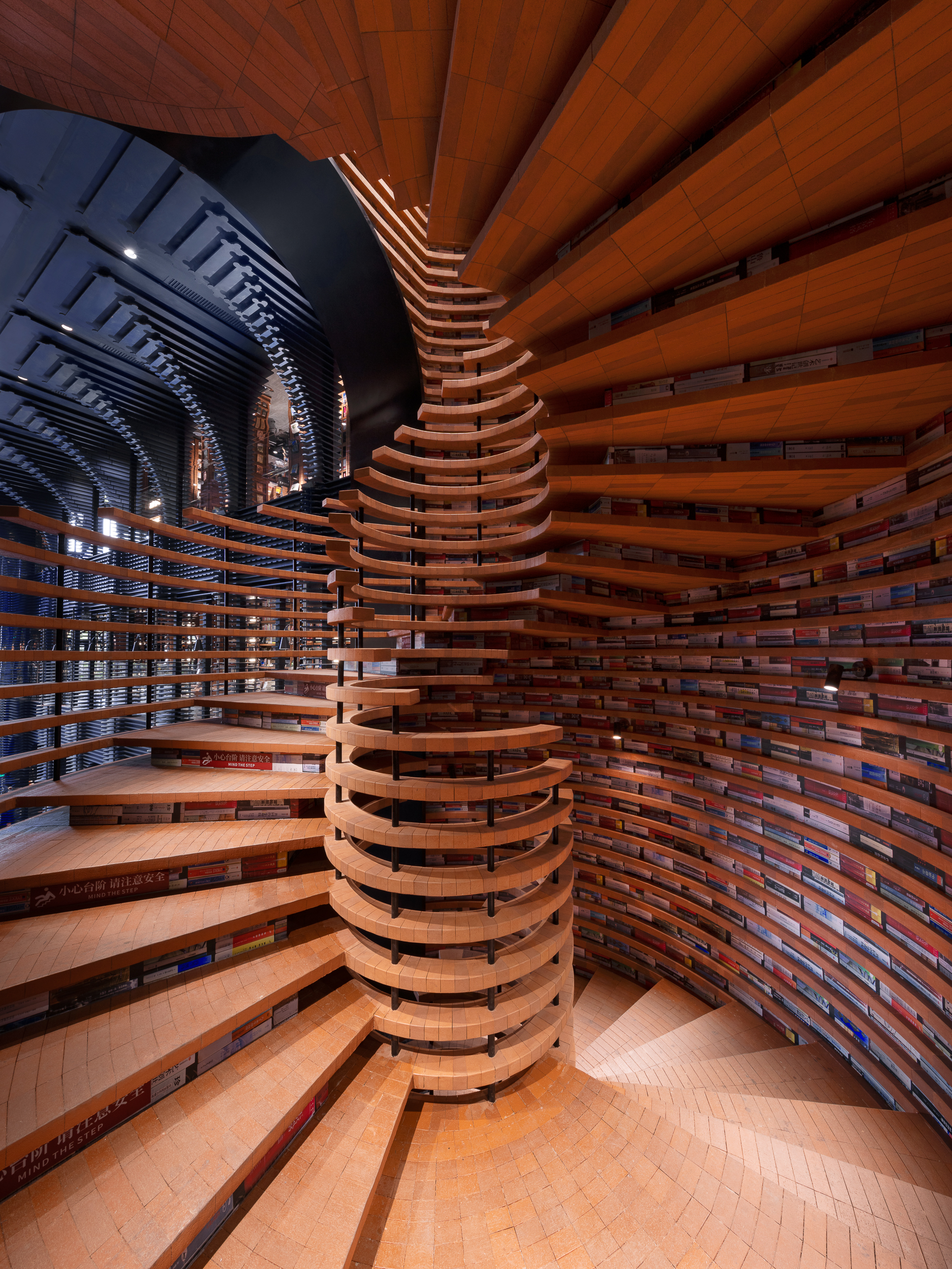 This bookstore chain has turned architecture into its brand. Every one of Zhongshuge’s outlets is designed by X+LIVING, and together they form a recognizable identity built from arches and labyrinth-like layouts. If you step into any of their stores in Shanghai, Chengdu or Tianjin, you will know instantly where you are. This branch ties that brand language to its context. Set in Tianjin’s Italian-style district, it uses nearly 400,000 custom red bricks to form sweeping arches, spirals and shelves. Even before you see the name, the architecture makes it clear you have entered Zhongshuge.
Legacy of Bodegas Faustino Winery
By Foster + Partners, Rioja, Spain
Popular Choice Winner, Bars and Wineries, 13th Architizer A+Awards
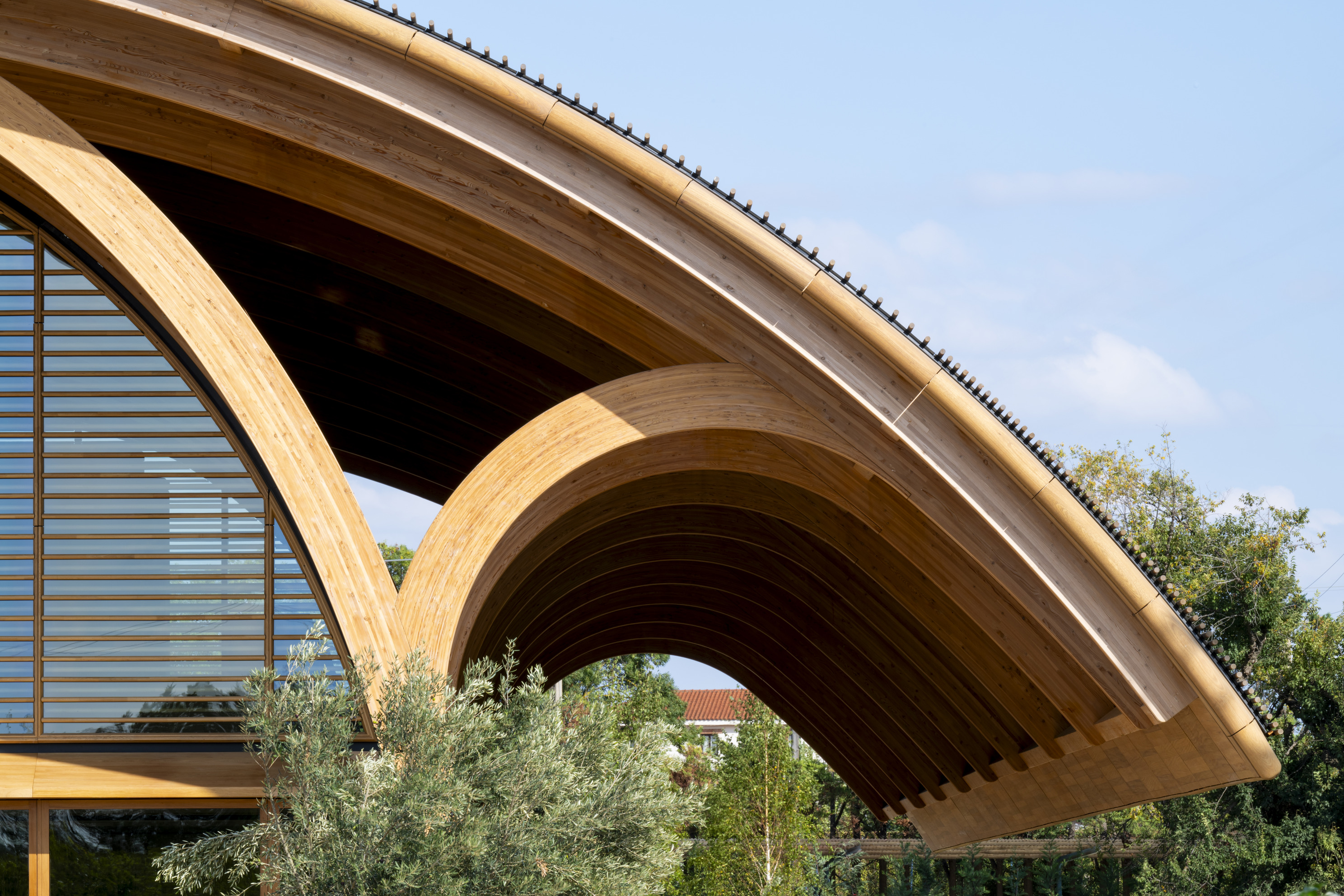
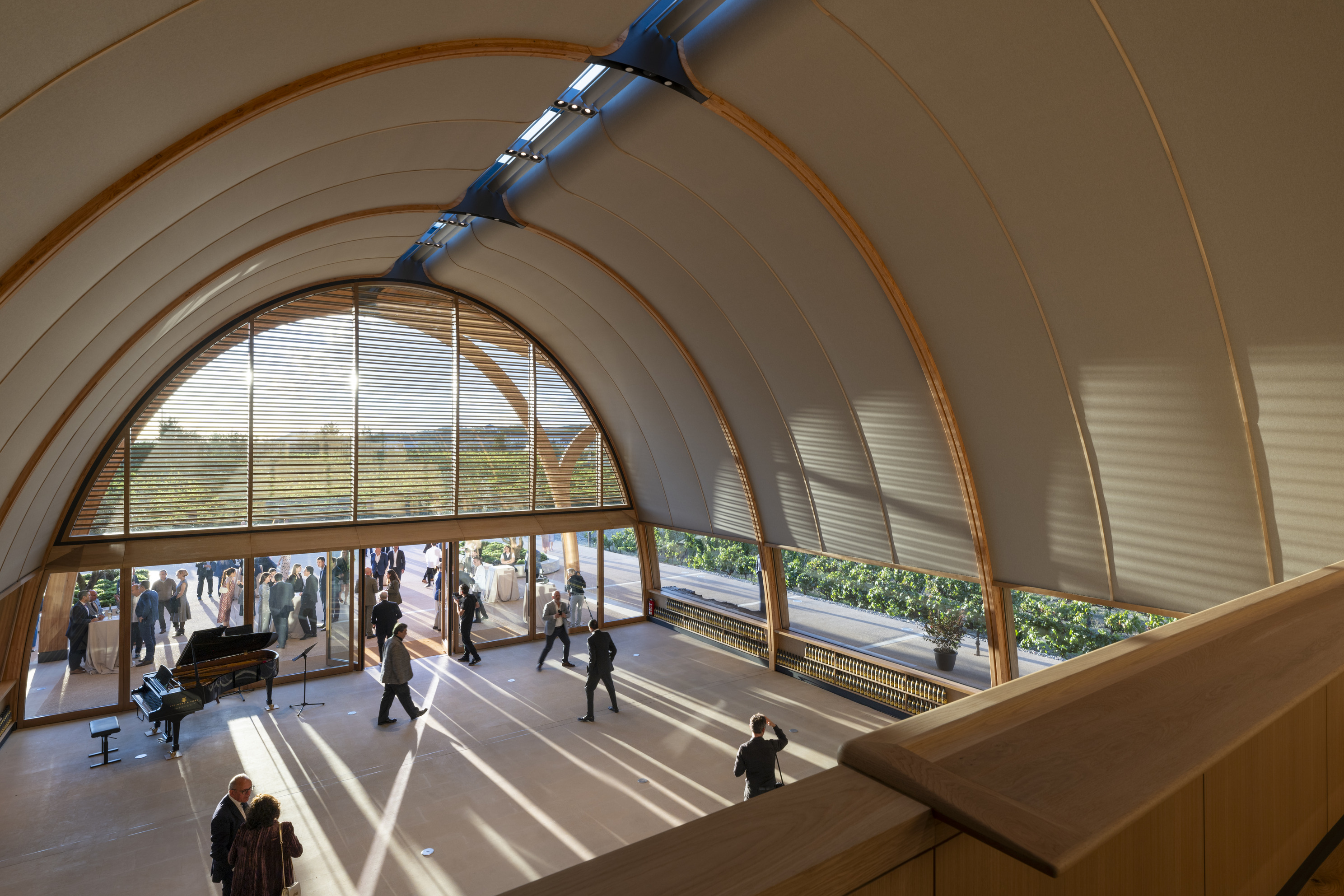 The Legacy of Bodegas Faustino project made the brand’s identity visible through its architecture. Foster + Partners designed the winery with elements that have appeared in the family’s other projects, especially Campillo and Portia. They used barrel-esque arches that run through both the interior and exterior. Inside, the halls stretch with a senI was sse of procession, tall and dramatic like a cathedral for wine. The scale is commanding, designed to give visitors the feeling that they are stepping into a place of heritage and ritual. With this project, the winery uses architecture as a deliberate way to express its brand identity.
The latest edition of “Architizer: The World’s Best Architecture” — a stunning, hardbound book celebrating the most inspiring contemporary architecture from around the globe — is now available for pre-order. Secure your copy today.
The post Beyond the Logo: 7 Projects Where Identity Speaks Through Design appeared first on Journal.