


Pigment of Imagination: 7 Bold Designs That Color Outside the Lines
The countdown to 13th Annual A+Awards winners' announcement has begun! Stay updated by subscribing to Architizer's Awards Newsletter.
When we appreciate architecture, it often comes from a place of feeling. Just like with art, the tilt of the head or a momentary squint reveals our attempt to understand the emotions woven into a space by the designer. Color and emotion in architecture are deeply connected, shaping how we experience and interact with our surroundings — from vibrant public areas to more intimate spaces. Through careful consideration of color, architects shape the aesthetics of a space, influencing not just its mood and functionality but also the deeper connections people form within it.
These seven projects use bright hues to cultivate connection, spark creativity, and enhance the experience of their occupants across different scales. Each demonstrates how color can serve as more than just decoration — it can shape identity, inspire activity and transform spaces into emotionally engaging environments.
Die Macherei München
By HWKN Architecture, Munich, Germany
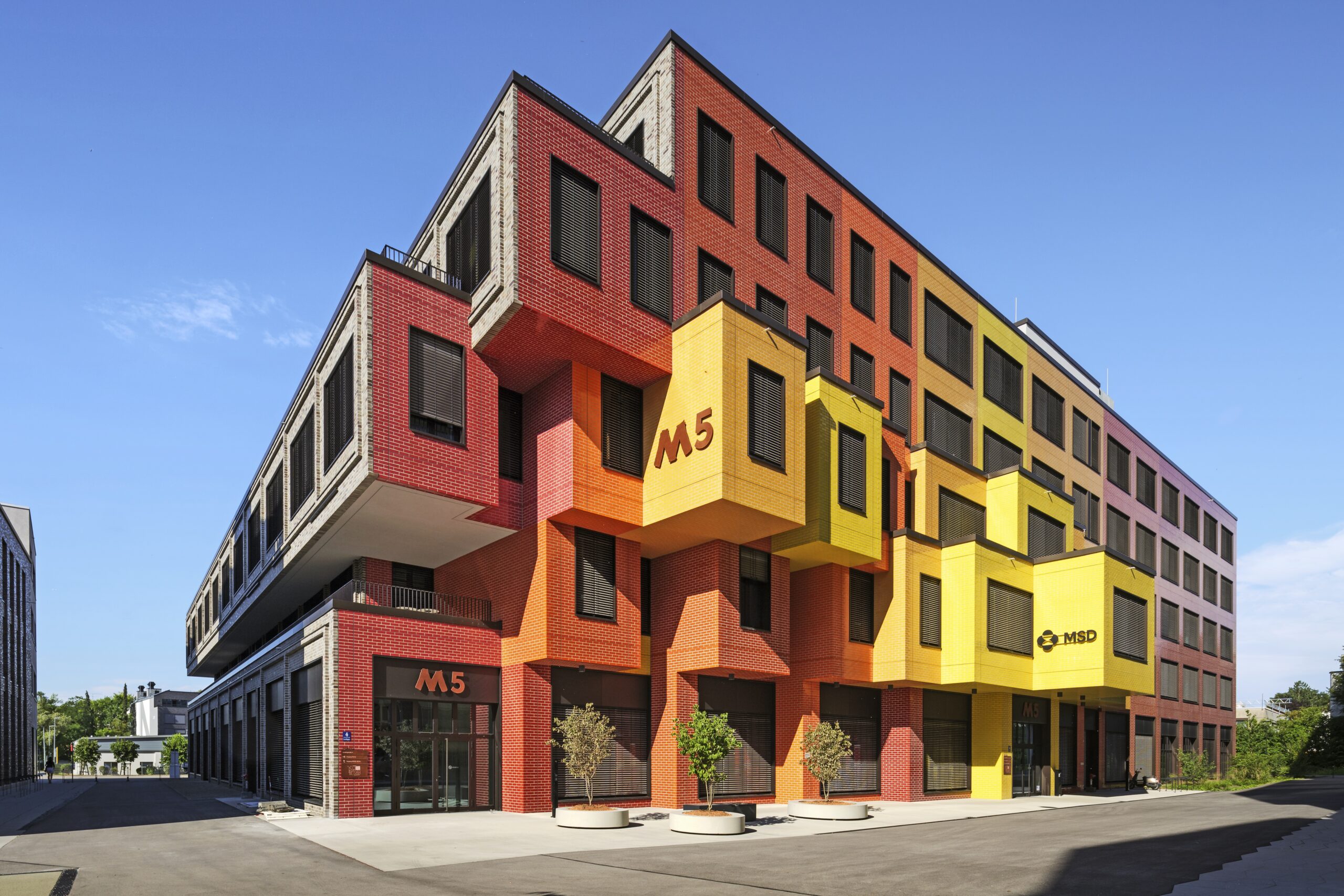
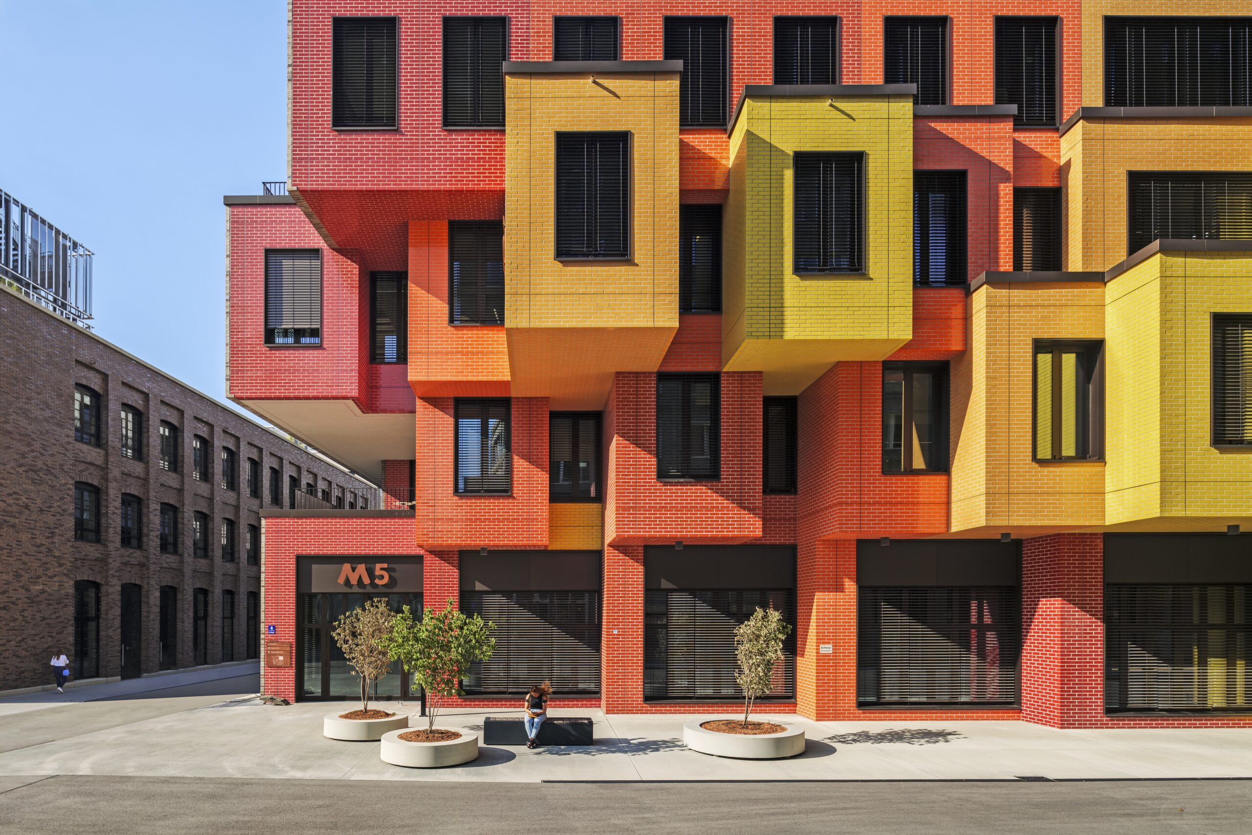 The façade’s dynamic color gradient transitions from an energetic red through a creative orange to a cheerful yellow. More than just an aesthetic feature, this gradient plays a critical role in reshaping the site’s industrial identity. This bold choice of colors now serves as an emotional light bulb to an area that was once barren and utilitarian. It now radiates warmth and has transformed into a vibrant, welcoming neighborhood filled with energy and emotion.
Neighbours
By ZAV Architects with Next Office, Fardis, Iran
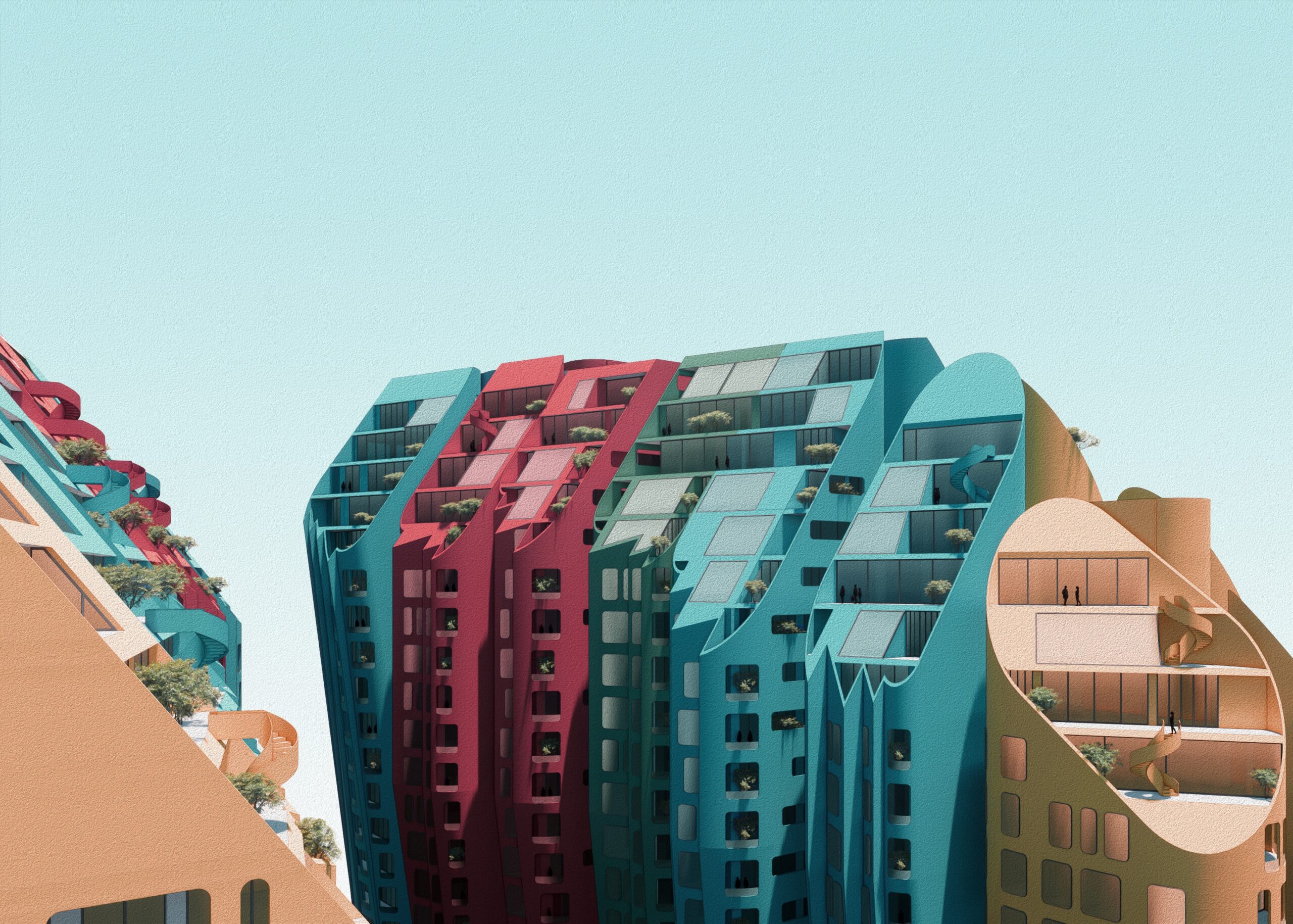
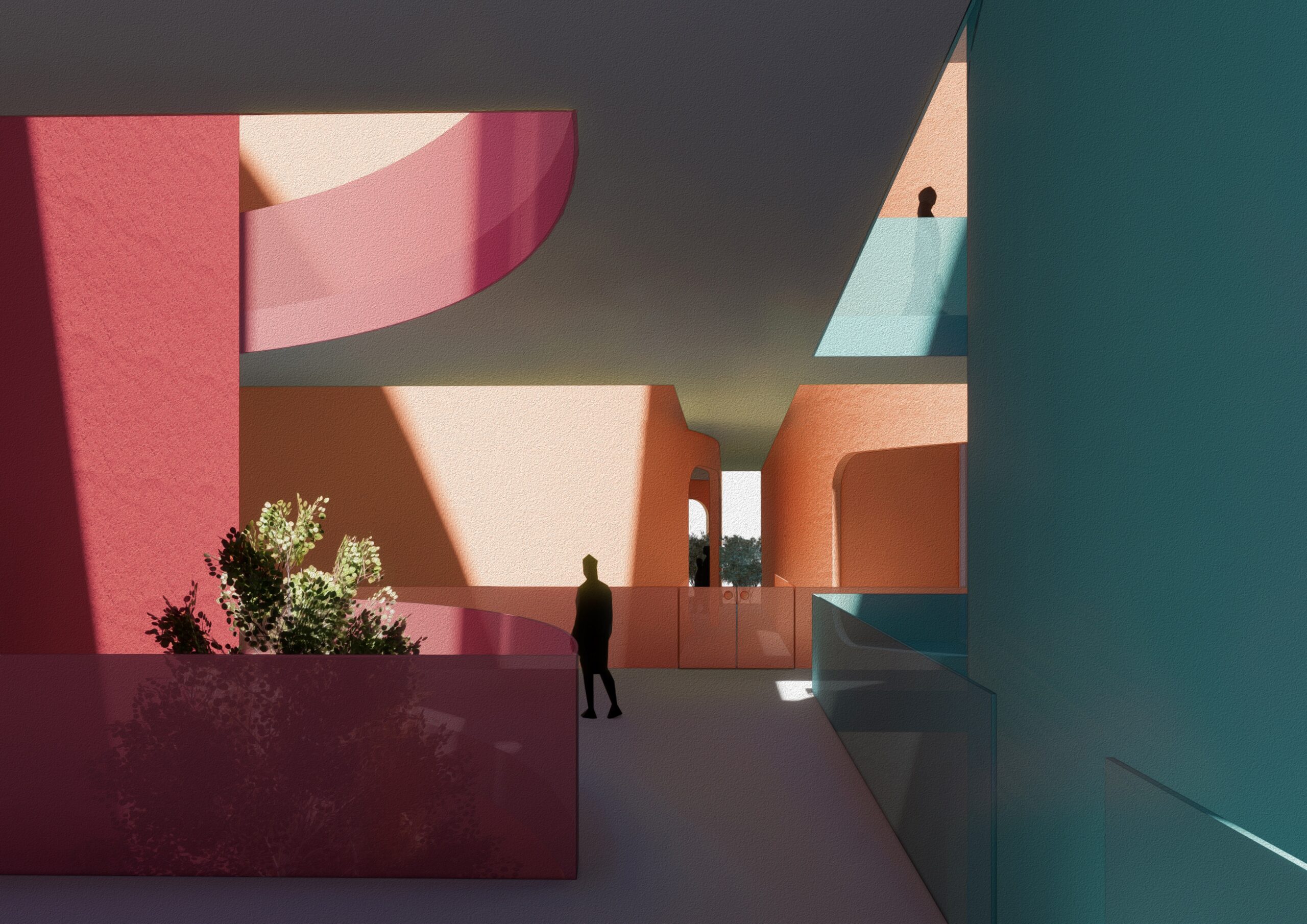 Working alongside shapes and massing, the designers used color to break the monotony of post-disaster construction in Fardis. A vibrant palette of coral reds, warm ochres and deep teals creates a dynamic landscape, giving each cellular-shaped unit its own identity. This intentional use of color fosters individuality and strengthens the sense of ownership within the community. It also introduces warmth and optimism, counteracting the impersonal feel that mass-produced housing developments often create. In a space where rebuilding is more than just physical restoration, color becomes a tool for emotional recovery and renewal.
Publicis Groupe, Le Truc
By Architecture Plus Information (A+I), New York
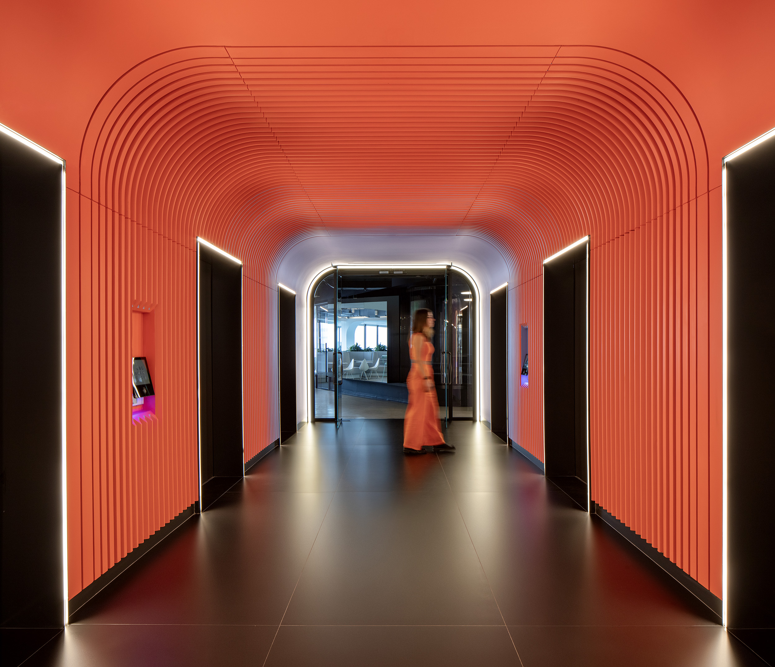
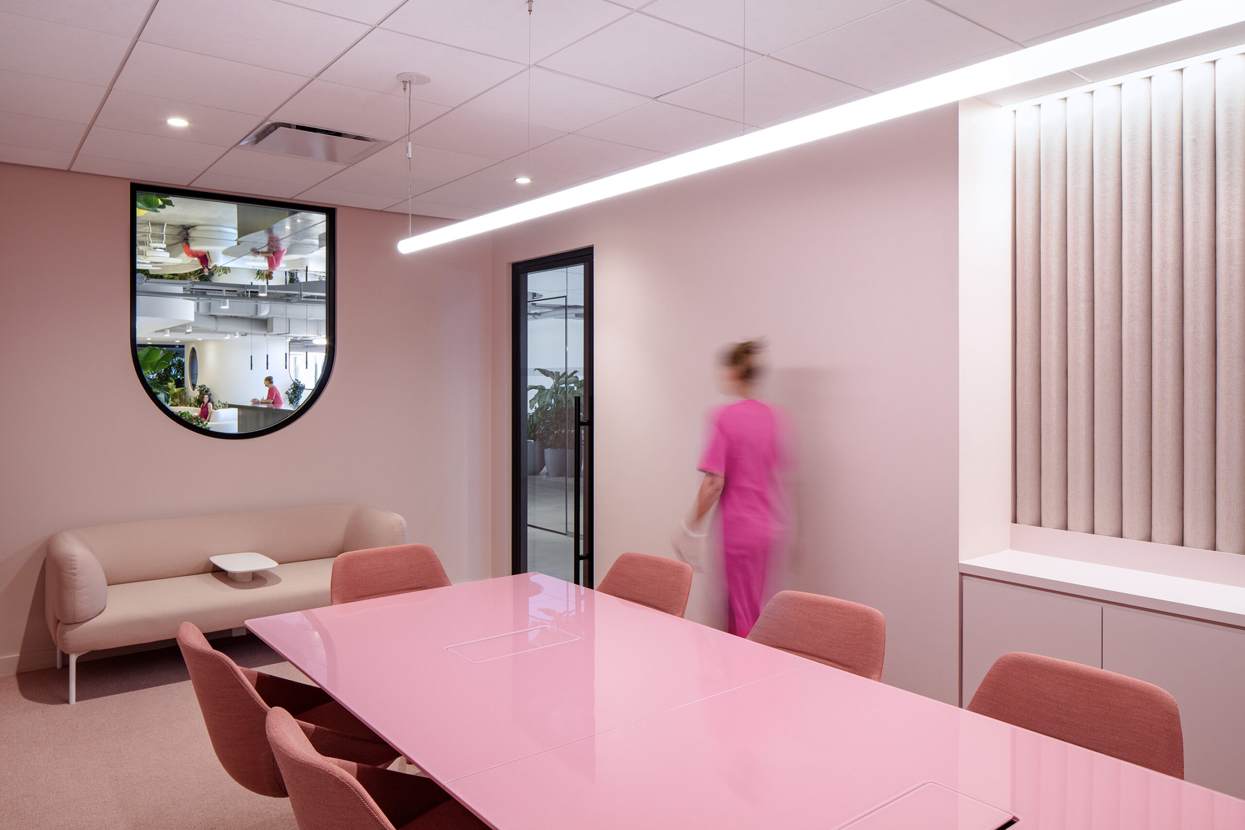 A+I infused the spaces with vibrant hues and shades to ignite creativity across the organization, making them the heart of Publicis’ creative culture. Colors like pink, green, yellow, orange and blue mark key stages in the organization’s creative process; each color choice serves a functional and psychological purpose. For example, the pink meeting room fosters collaboration by creating a sense of openness and encouraging dialogue. The green break room promotes relaxation, allowing employees to recharge between tasks. Meanwhile, the orange hallway injects energy and dynamism into circulation spaces, ensuring that movement through the office feels inspiring rather than routine.
Arts District Project
By Perkins & Will, Los Angeles
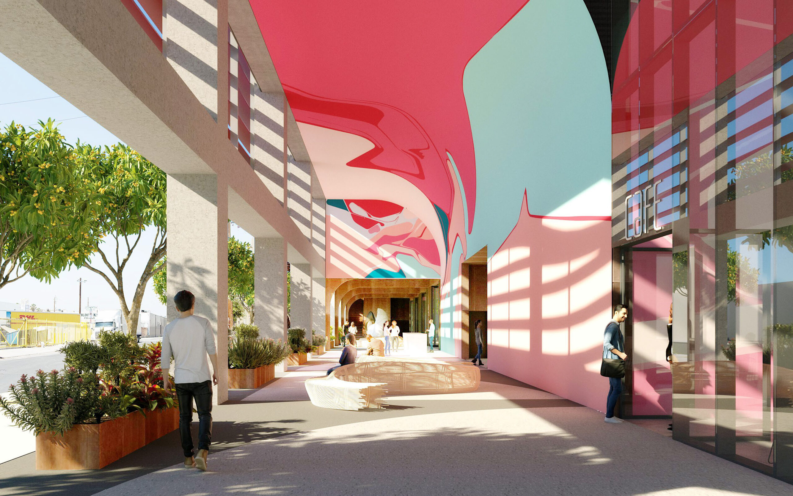
 The building’s façade features aluminum louvers wrapping around its concrete frame. Painted in bright colors, they enhance energy efficiency as solar filters while doubling as large-scale murals. The color palette echoes the site’s industrial past, drawing from the textures of brick, concrete, and steel, as well as the bold murals and wheat-paste posters that characterize the district’s streetscape.
This fusion of color and function makes the facade more than just an aesthetic statement — it becomes a storytelling element, connecting the building to its urban fabric. By reflecting the neighborhood’s artistic character, the project honors the Arts District’s legacy while promoting sustainability and energy efficiency.
‘Charles Aznavour’ conservatoire of music, theatre and dance
By Dominique Coulon & Associés, Montigny-le-Bretonneux, France
 The designers infused the academy’s façade with dynamic dichroic films that create colors whose hues depend on where a person stands and the sun’s movement. This kaleidoscopic effect ties the interiors together, reinforcing the academy’s artistic identity. Inside, bold colors heighten the drama—vivid blacks and striking reds bathe some rooms, sparking creativity, energizing performers and immersing them in an atmosphere of expression.
Beyond aesthetics, this use of color and light influences how performers and students experience the space. The changing hues create a sense of movement, reflecting the rhythm and emotion of the performing arts. Just as music and theater rely on shifts in tone and intensity, the conservatoire’s colors evolve throughout the day, reinforcing the dynamism of artistic expression.
Haus 2+
By Office ParkScheerbarth, Berlin, Germany
 The bold red façade of Haus 2+ serves as a striking entrance to Holzmarkt 25, injecting life — just like blood — into the cultural quarter. As an entry point, its evolving tone throughout the day reinforces the building’s progressive nature, making a bold statement amidst its eclectic surroundings. The combination of red and larch wood adds contrast and mirrors the creative energy of the diverse tenants who also bring the space to life.
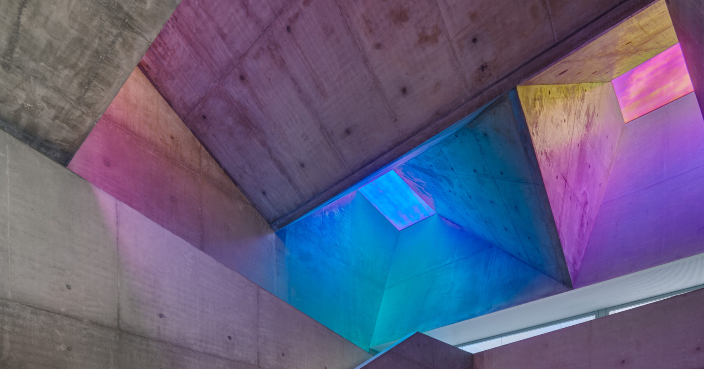
Wonderland Elementary School Kindergarten Classroom, Play Areas, and Learning Garden
By John Friedman Alice Kimm Architects (JFAK), Los Angeles, California
 Designed for children, the kindergarten integrates color and form to spark wonder and discovery. The colorful louvers that trace the playful swoops of the facade create a sense of movement and energy, while polycarbonate fins above a large roof opening cast multi-colored hues of light into the space.
Inside, the thoughtful application of color extends into the classrooms, where the designers infused different pops of color to enhance the environment and foster curiosity. Each shade contributes to a unique atmosphere — softer hues create a calming effect for focused activities, while bolder tones inspire creativity and play.
The countdown to 13th Annual A+Awards winners' announcement has begun! Stay updated by subscribing to Architizer's Awards Newsletter.
The post Pigment of Imagination: 7 Bold Designs That Color Outside the Lines appeared first on Journal.