














"Is colour actually architecture?" panellists ask at Arca talk in Miami

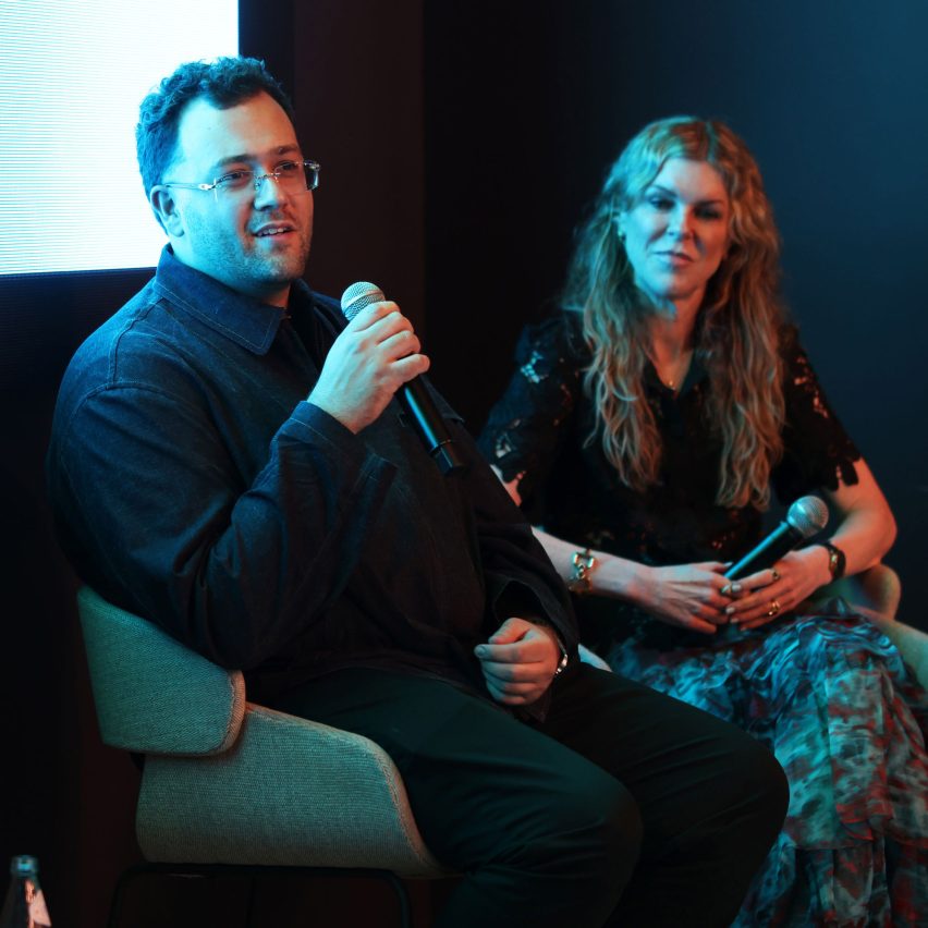
Promotion: in a time of dopamine design and AI tools, a group of design industry professionals at an Arca talk discussed what role colour is playing in the contemporary American home.
Colours such as olive greens and a shade called Black Martini are in, according to Tony Piloseno, owner of Orlando-based company Tonester Paints.
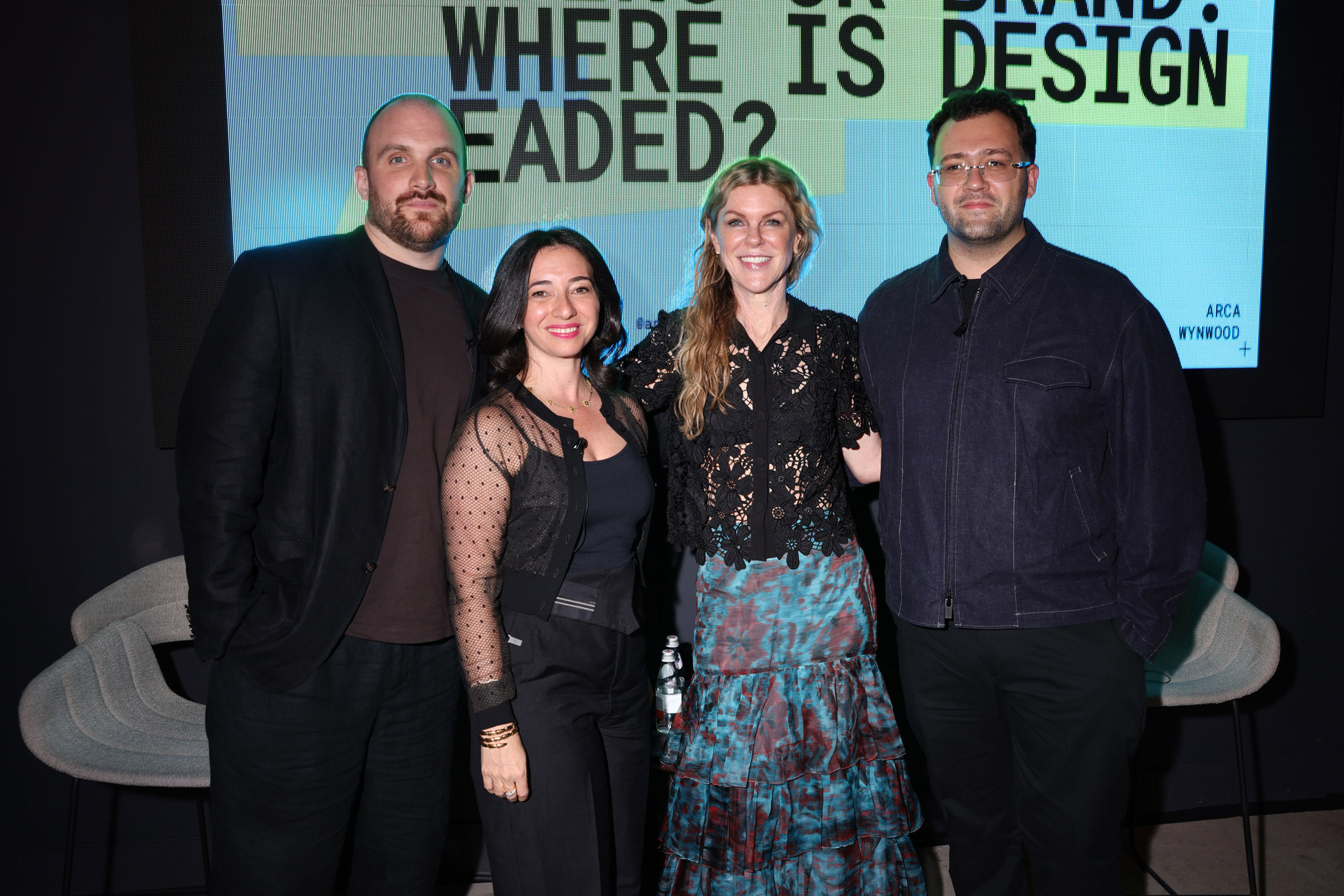
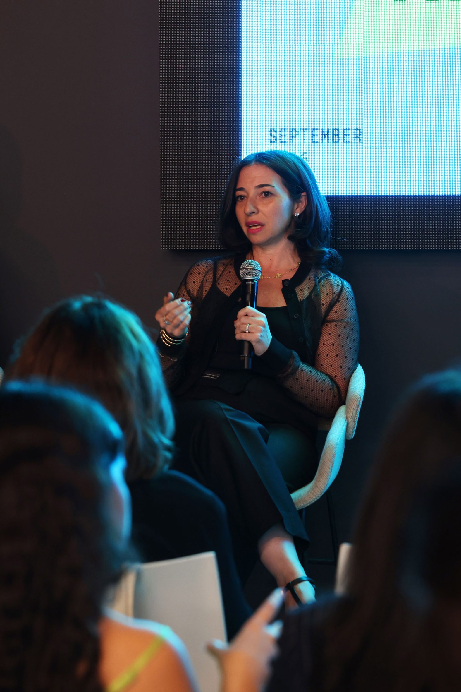
Piloseno joined interior designers Kati Curtis and Tamara Feldman for a conversation at Mexican stone company Arca's showroom in Miami, moderated by Dezeen US editor Ben Dreith.
And while the panellists agreed that rich, dark colours are in at the moment, the most important element of contemporary colour usage is about experience and reevaluating how people choose colour.
"I use tons of colour in my work, but what I'm thinking about, more so than trends, is how are we using colour?" said Curtis. "Are we using colour as an applied element, or is colour actually architecture?"
Both Curtis and Feldman referenced the work of Mexican modernist architect Luis Barragán in their framing of colour as more than a trendy accent.
"The term colour blocking has always bothered me because I feel like it's an accent – it's like putting wallpaper on one wall," continued Curtis. "It feels to me like you ran out of money, and you just went with that."
An expanded conception of colour utilises light, texture, and the aim should be to envelop whoever is in a space. The panellists noted how the presence of tinted glass in Miami makes this even more important.
This, for Feldman, means that the whole of an interior – including light – and all the way through to the artwork on the walls should work together.
"I don't think it's just about a colour and a wall," she said. "I think it's the whole concept together."
Feldman is currently designing a coffee pavilion for the Institute of Contemporary Art in Miami, where she has used mirrors and Arca's Umbria-fabricate tiles to create a sculptural work in the institution's gardens.
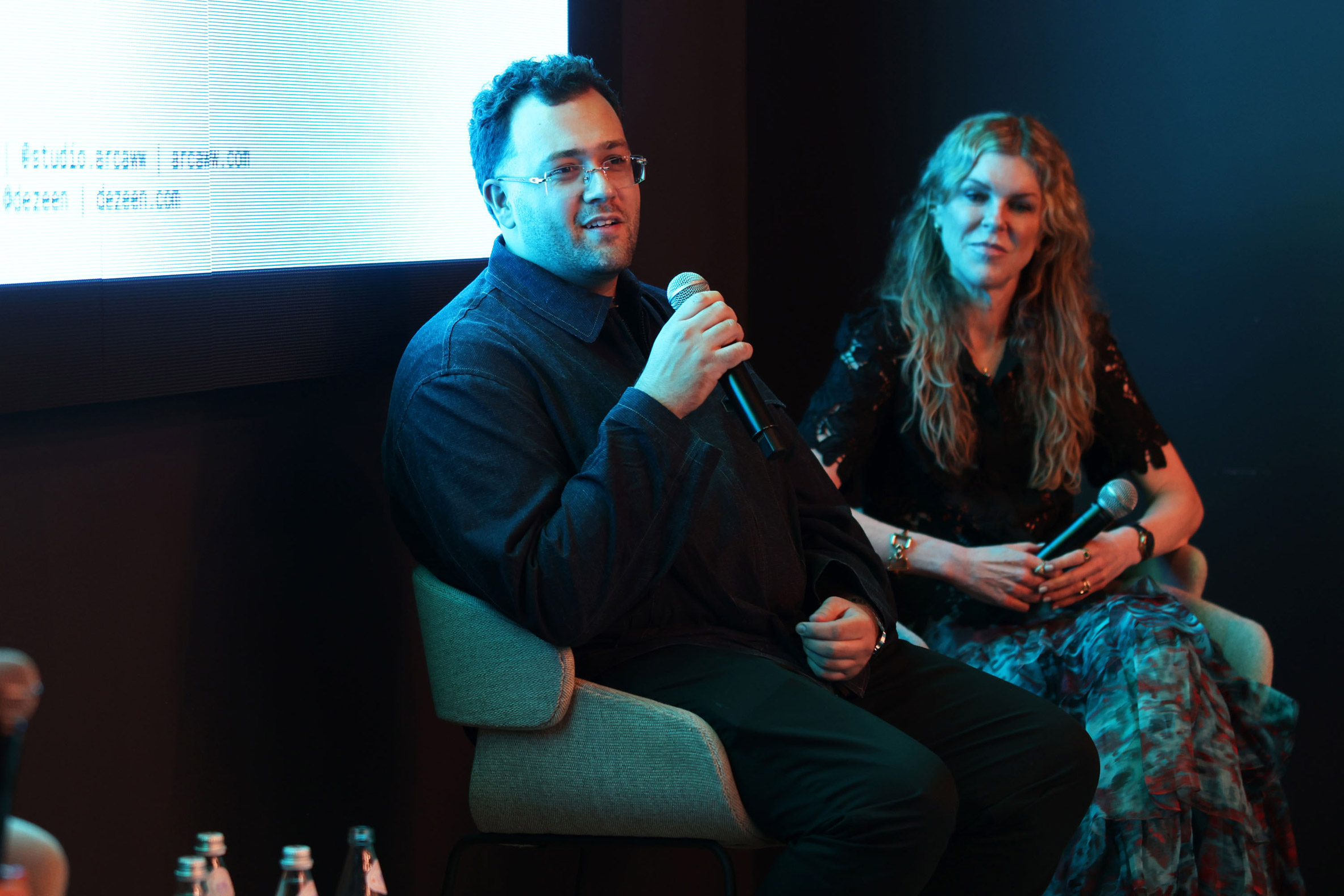
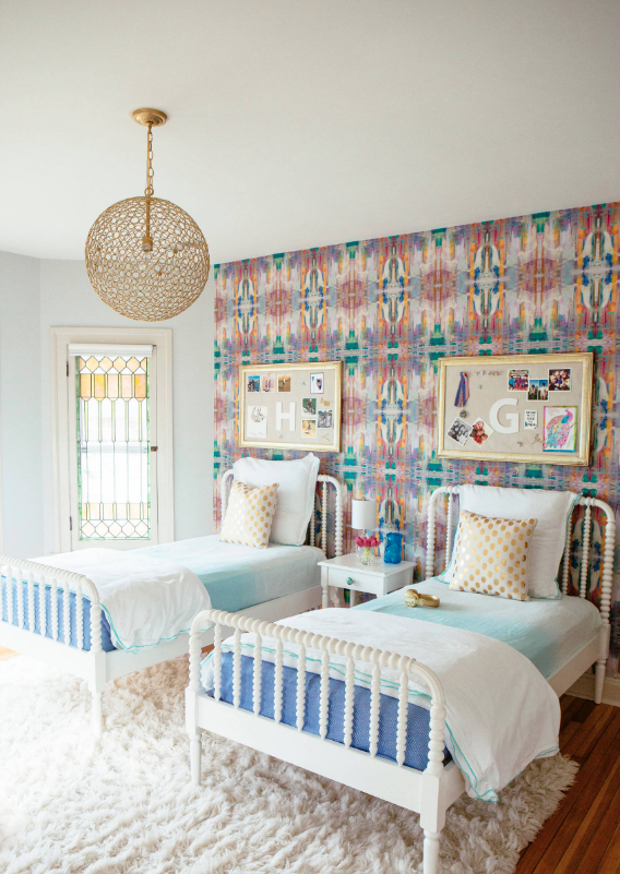
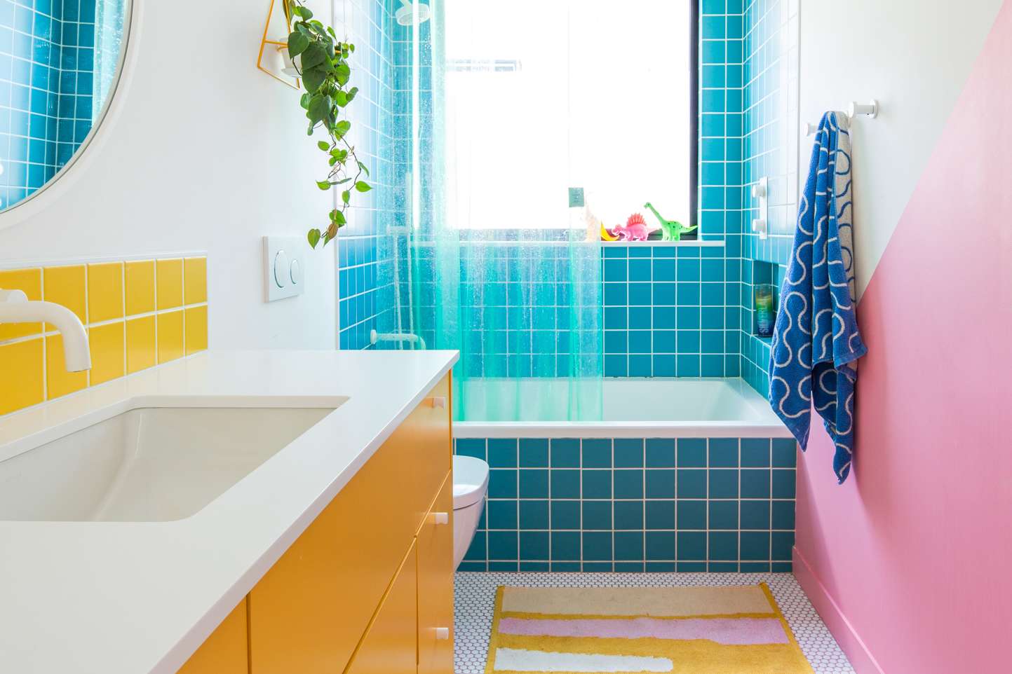
The idea that colour should envelop and create an emotional response has become a hot topic recently, with the emerging trend of so-called "dopamine design" seeing spaces covered in bright colours and mish-mashed patterns to stimulate the mind.
The panellists agreed that colour can work to make you feel at ease, comfortable or inspired, but that this is more related to individual preference and experience than any set configuration or style.
"Does the room look really cool on TikTok, then you hate it 15 minutes later because you threw it in there to try to create this cool picture?" asked Curtis. "It can definitely go in the wrong direction too if you don't know what you're doing."
Piloseno added that dark colours that wash over you can have a positive effect as well.
"There is a direct emotional impact that colour has, especially with these darker colours," he said.
The panellists also addressed AI in design, and how choosing a colour scheme can be risky. For example, once you apply the paint or veneer, it takes a significant amount of work to pivot in a different direction.
Visualisation tools have existed for years, but Curtis said that generative AI has allowed her to show clients what a space might look like more easily before they commit.
"Even if it's not an accurate representation of exactly what the colour is going to be, I think it's very helpful in giving clients an idea of the overall room rather than just testing a sample," said Curtis.
"What AI and just any kind of colour visualiser tool will help with is seeing the specific colour vertically or how it's going to look on the ceiling with specific shadows," added Piloseno.
Ultimately, though, the panellists agreed that the pursuit of colour, and whatever downstream emotional effects, requires a human touch.
"I think the whole process of selecting colours is very personal," said Piloseno. "You shouldn't have AI guide you to these specific colours."
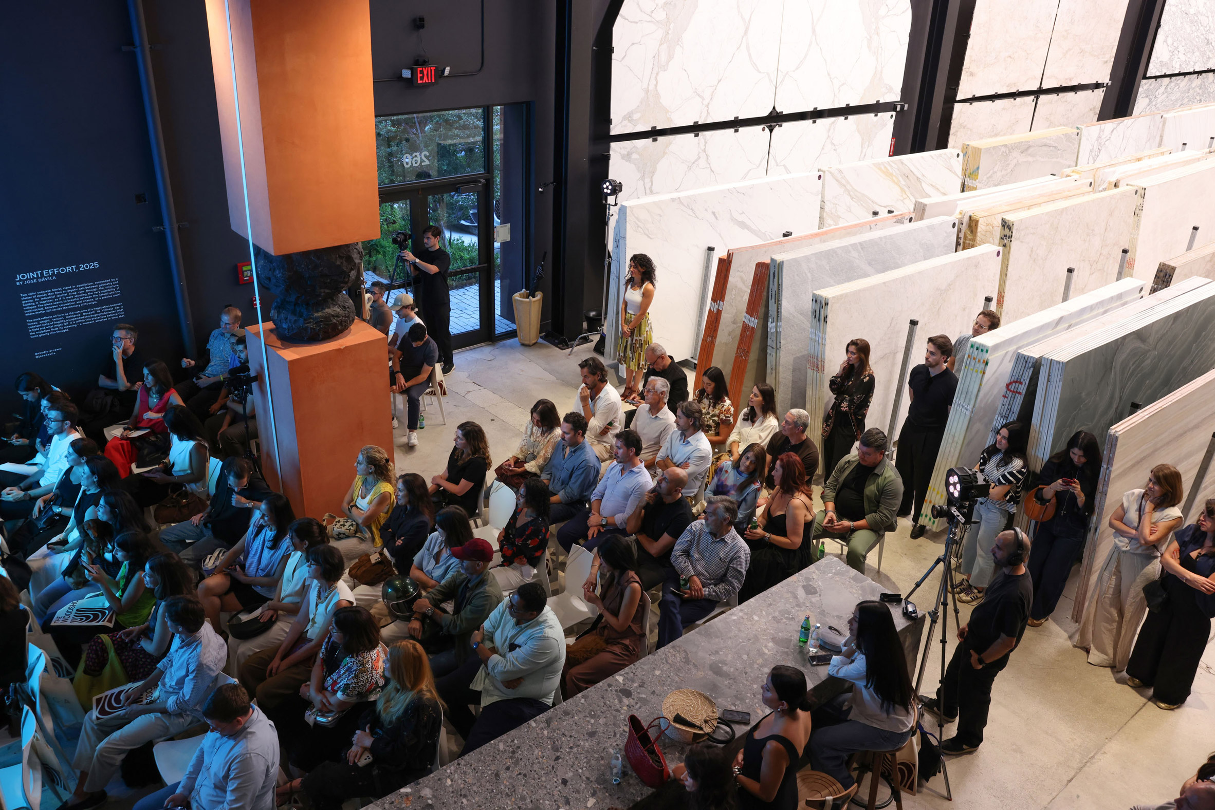
The speakers added that personal relationships and understanding the emotions of clients are paramount.
Colour choices often represent this dynamic more than other aspects of design. If a designer is going to understand what will engage the mind, they need to know the mind in question.
"What we do is really part therapy, part design," said Feldman.
Technology underwrites the process while the person guides the choices on the table. And while neuroscience has created new streams for engaging with design schemes, Curtis said that the foundations remain as important as ever.
"As long as you stick with those fundamental elements that we all know, we can mix all of those things in a really beautiful way," added Feldman. "That's going to make everybody's dopamine work."
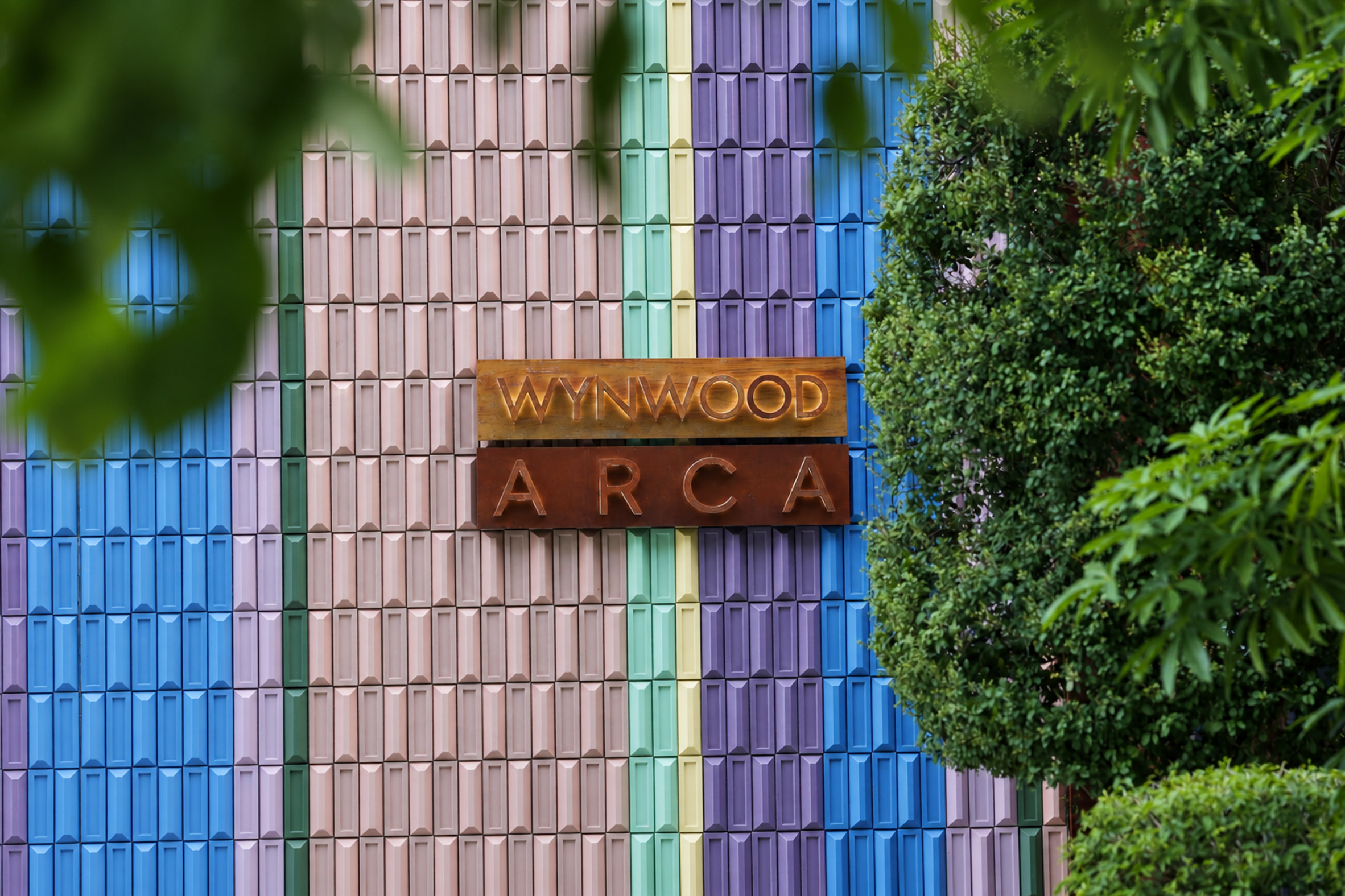
To learn more about Arca, visit its website.
Partnership content
This article was written for Arca as part of a partnership. Find out more about Dezeen partnership content here.
The post "Is colour actually architecture?" panellists ask at Arca talk in Miami appeared first on Dezeen.