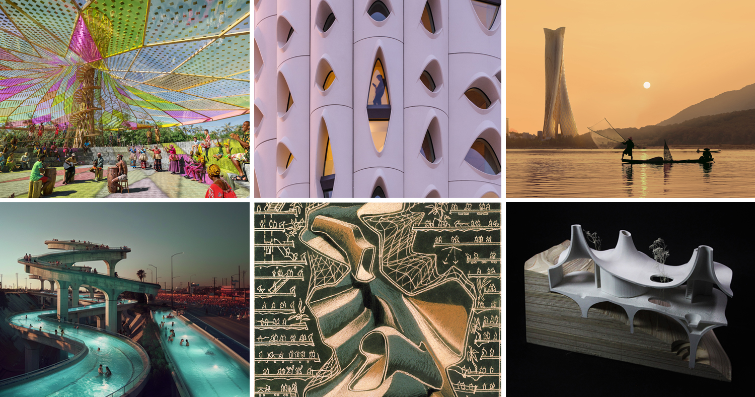
.jpg)


Filling in the Gaps: Infill Architecture at Its Most Inventive
Architects: Want to have your project featured? Showcase your work by uploading projects to Architizer and sign up for our inspirational newsletters.
Infill architecture is more than the act of building on underused urban plots — it’s an exercise in turning limitations into design catalysts. Faced with impossibly narrow lots, tight zoning regulations, and the challenge to balance privacy with openness, architects are exploring innovative ways to make infill architecture both efficient and expressive.
Far from a compromise, infill can function as a design laboratory for testing new structural systems, material applications, and spatial strategies. Vertical stacking integrates multiple programs within tight footprints, while open layouts and column-free spans maximize adaptability over time. Light and air are coaxed into every corner through angled setbacks, open circulation, and rooftop terraces that extend usable space.
In some cases, adaptive reuse becomes the infill strategy itself — reimagining existing structures with upgraded façades, reconfigured interiors, and improved street-level engagement. These interventions prove that revitalizing a building’s original footprint can be as impactful as starting from scratch, offering fresh urban presence while preserving embodied energy.
The projects highlighted below show that successful infill isn’t defined by scale, but by strategy. Through vertical layering, hybrid programming, light-maximizing techniques, and clever engagement with site conditions, architects are turning constraints into opportunities and transforming underused sites into high-performing, connected urban spaces.
1. Narrowing Down Vertical Typologies
Ferrocarril de Cuernavaca 780 by HEMAA, Mexico City, Mexico
Jury Winner, Office – Mid Rise (5-15 floors), 13th Architizer A+Awards
Ferrocarril de Cuernavaca 780 by HEMAA, Mexico City, Mexico. | Photos by César Béjar | Jury Winner, Office – Mid Rise (5-15 floors), 13th Architizer A+Awards
Ferrocarril de Cuernavaca 780 is an innovative office tower in Mexico City that transforms a narrow, underutilized plot into a vertical structure that reflects the site’s industrial heritage and the city’s urban ambitions. The building is positioned between a narrow street and the renovated Cuernavaca Railroad, now a linear park. Everything about the building speaks of space efficiency and integration with its surroundings.
Inspired by aesthetic proportions and classical building elements, the building features a base, shaft, and capital composition that responds elegantly to its context. Its structural façades allow for column-free, flexible layouts while the expansive glazed surfaces bring in natural light and strengthen the building’s connection to the city.
A café and green terraces on the ground floor create a welcoming threshold between the city on one side of the building and the park on the opposite side. A robotic parking system, spread over 13 levels below and above ground, addresses the constraints of the compact site and local zoning regulations. Each typical floor is organized for clarity and efficiency, while a setback on the 13th floor creates an outdoor space that offers sweeping views of the park and the Mexico City skyline, complemented with rooftop gardens and outdoor gathering spaces.
Beyond its design contributions, Ferrocarril de Cuernavaca 780 helps revive its neighborhood by opening part of its site to the public, bridging the busy street and the new park to support a more connected, vibrant, and livable city —a notable example of urban infill enhancing community life.
2. Contextual Infill, Strong Identity
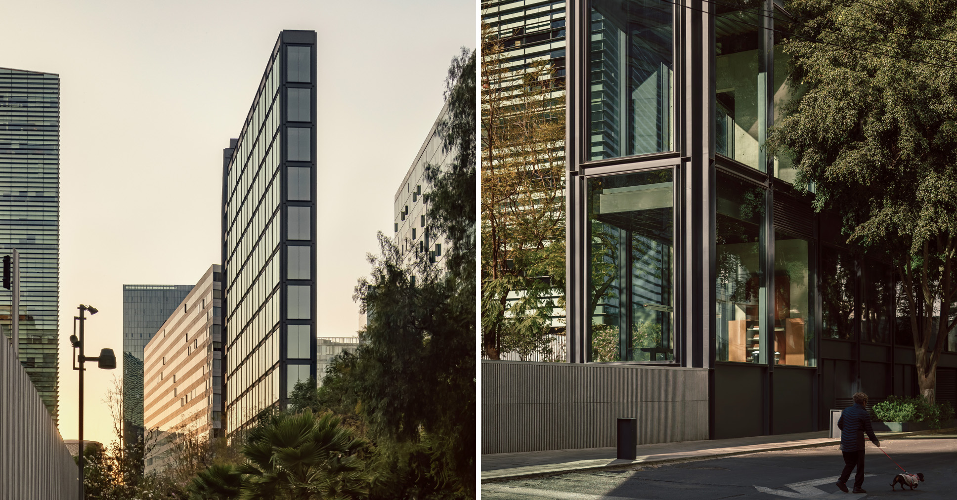
QO by Archetonic, Mexico City, Mexico
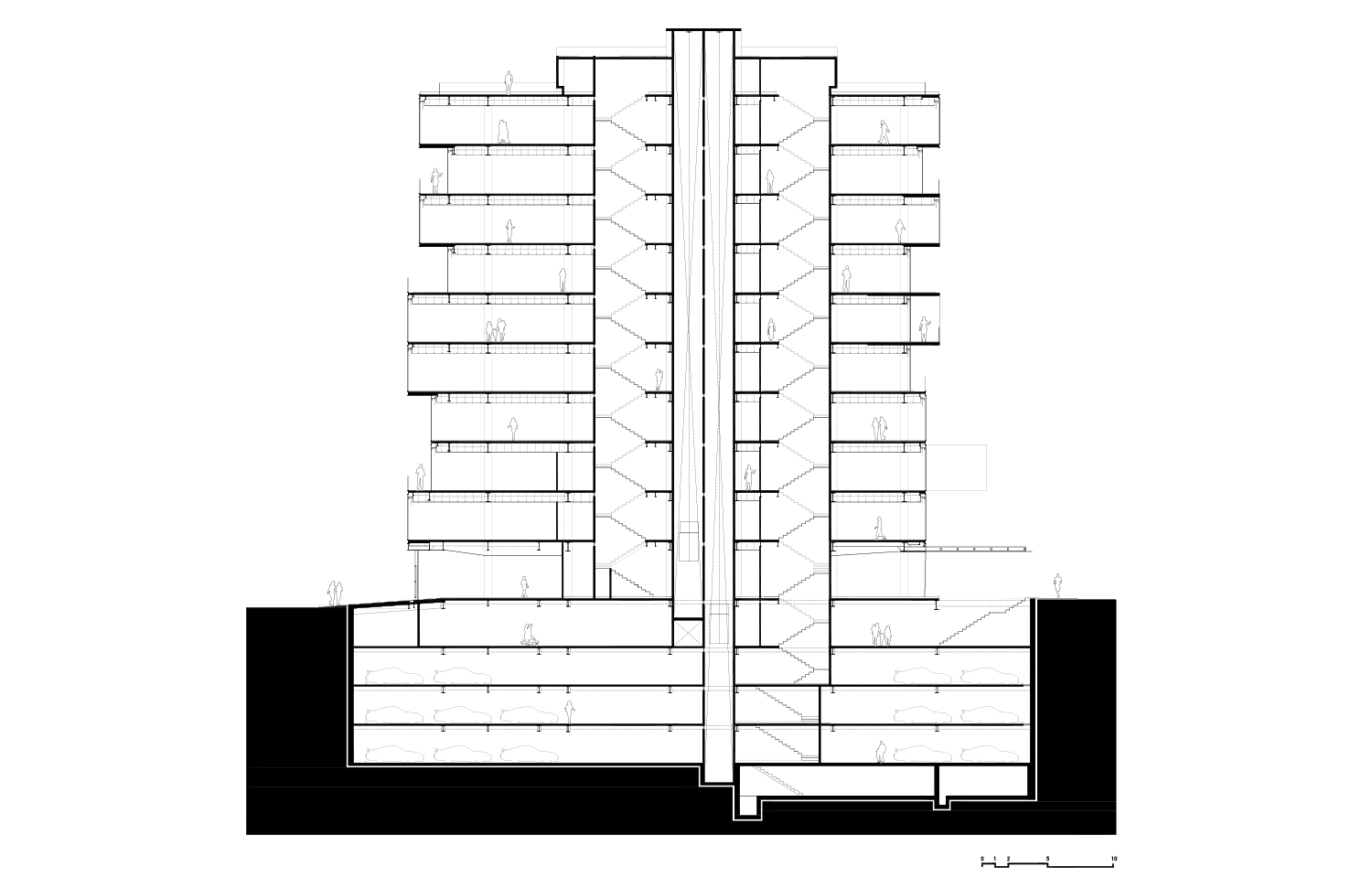
QO by Archetonic, Mexico City, Mexico | From top to bottom: photos by Andrés Cedillo; Floor plans; building section
QO is a mixed-use urban infill project that connects two busy streets near the lively Condesa and Roma neighborhoods in Mexico City, right next to the green expanse of Chapultepec Forest. The project responds to its dense urban context with a slender rectangular form, typical of effective infill developments. Its design showcases staggered floor levels, creating generous terraces. Generous glazing draws daylight deep into the interior spaces while offering sweeping views of the city skyline.
The building’s material palette —glass paired with exposed cast-in-place concrete— creates a distinctive presence, adding visual depth and a strong urban character. Inside, structural elements remain exposed, emphasizing spatial clarity. QO hosts residential, office, and commercial spaces within narrow floorplates of just 10 meters (approximately 33 feet) in width and around 400 square meters (approximately 4,305 square feet) per floor.
Despite the site’s tight constraints and regulatory complexities, QO integrates gracefully into its urban surroundings, with a ground-level café and commercial space that activate the street and foster neighborhood engagement. QO exemplifies how thoughtful design can maximize limited land in a dense urban setting, delivering functional, flexible spaces while enhancing the surrounding cityscape.
3. Optimizing Through Mixed-Use Design
Better Together by VIVE Design Studio, Hat Yai, Thailand
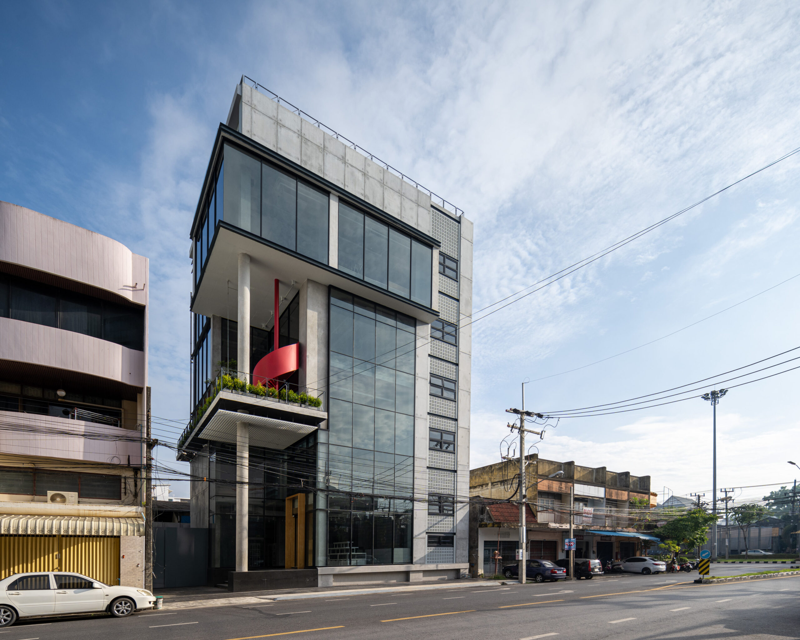
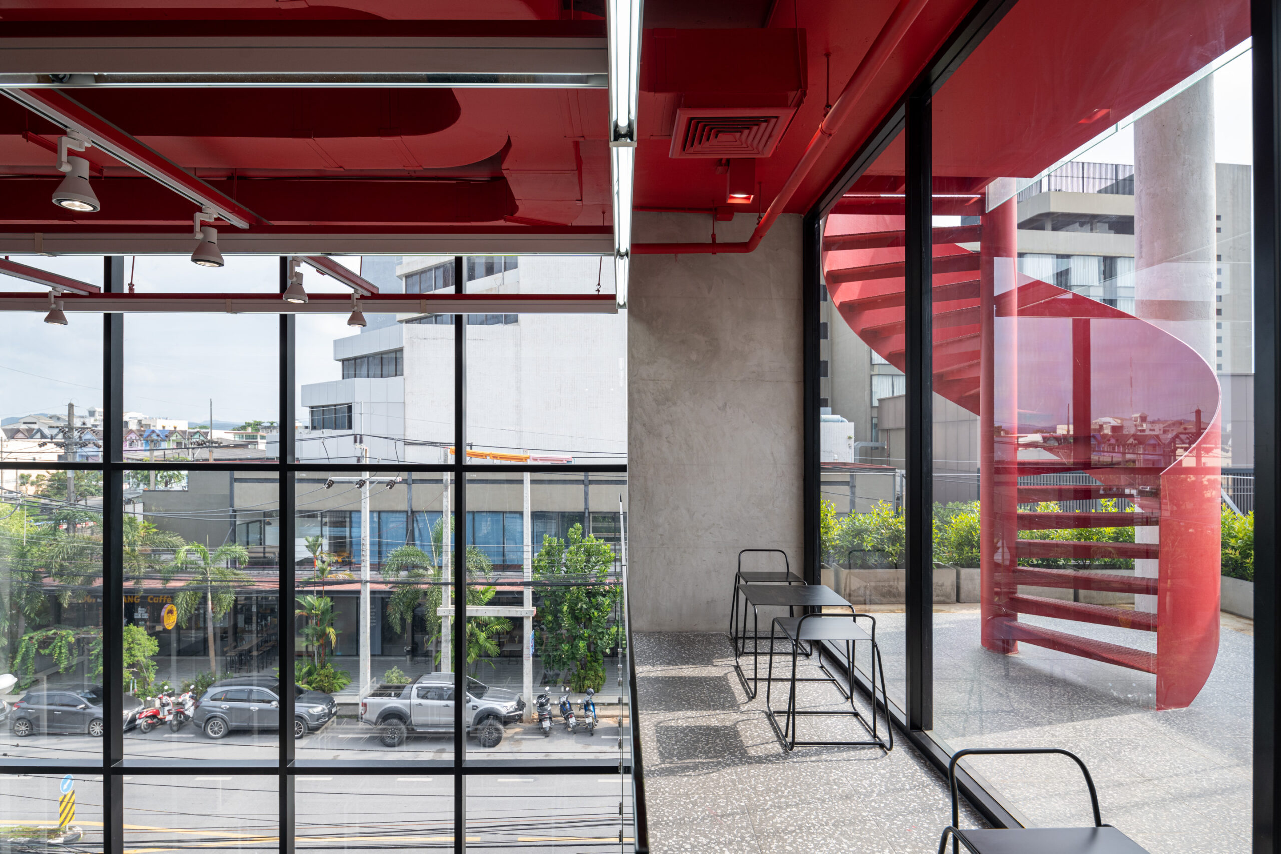
Better Together by VIVE Design Studio, Hat Yai, Thailand | Photos by Beer Singnoi
Better Together is a six-story mixed-use building, designed as a compact “one-stop” destination. The building houses retail spaces, a café, co-working areas, meeting rooms, and support functions within just 1,000 square meters (approximately 10,764 square feet). Faced with a narrow urban site, VIVE Design Studio embraced verticality by stacking the program across levels. Yet they intentionally blurred the boundaries between levels to create a sense of spatial continuity. Retail occupies the first two floors, while cafés and co-working spaces share the third and fourth. The fifth floor houses meeting spaces, offices, and an auditorium on the top level.
Better Together conveys a sense of openness and architectural vitality. Generous façade openings reveal glimpses of the building’s interior functions, interlocking volumes, and playful features such as a striking red spiral staircase. Meanwhile, the overall design maintains a thoughtful dialogue with its surroundings. Despite its limited footprint, Better Together delivers a spatially rich and socially engaging environment, making the most of its vertical form to connect people, uses, and experiences in a cohesive urban infill strategy.
4. Shaping with Constraints and Regulations
SOSEUM by SML in collaboration with Coom Partners, Mapo-gu, South Korea
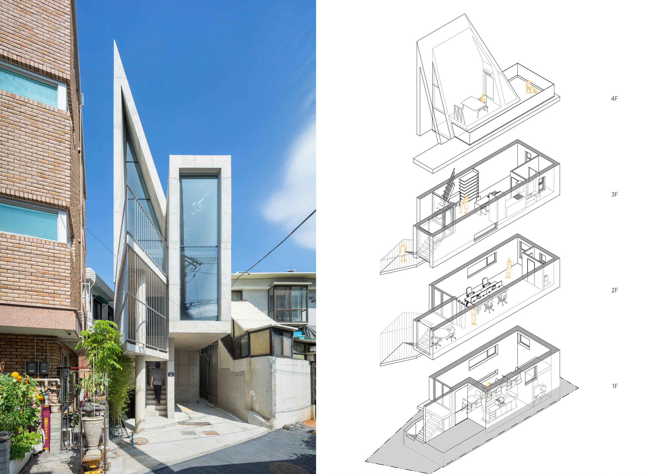
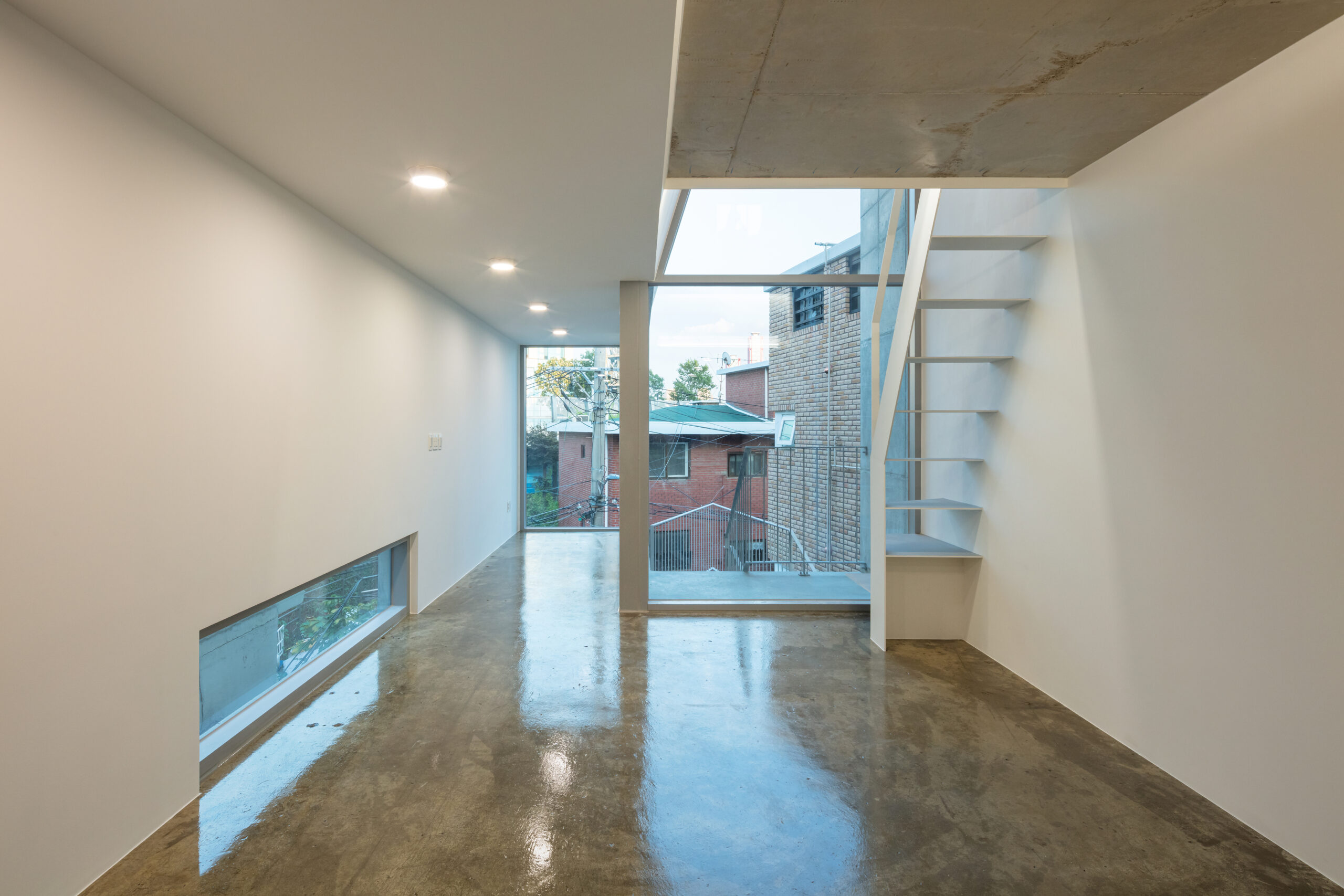
SOSEUM by SML in collaboration with Coom Partners, Mapo-gu, South Korea | Photos by Kyungsub Shin; Exploded axonometric, above.
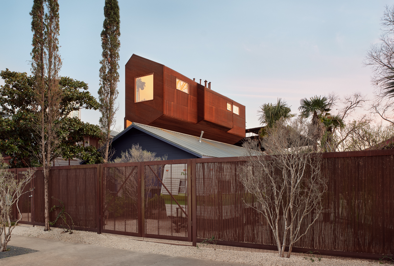
SOSEUM is a single-family home that rises above a dense field of low-rise brick buildings in one of Seoul’s most populated districts. In recent times, the area has undergone revitalization with cafés, design studios, and other creative businesses moving in. Built on a long-vacant, narrow lot just 5.6 by 17 meters (about 18 by 56 feet), the project responds to extreme spatial constraints and strict residential zoning codes, including sunlight-access rules that mandate setbacks based on height and orientation.
SOSEUM’s design overcomes these challenges by incorporating angled setbacks in its massing. The combination of height, sloped roofs, and well-oriented windows ensures that the interior of the home receives abundant daylight in winter, while minimizing overheating during warmer months. The narrow floor plates facilitate light to reach deep into the interior, creating a bright and airy atmosphere that offsets the limited space. A standout feature, the semi-open staircase creates a porous boundary between the home and the street, amplifying the overall sense of openness within the compact infill structure.
By integrating these strategies, SOSEUM’s design offers a thoughtful response to urban density, leveraging design, light, and openness to turn spatial limitations into design opportunities.
5. Adaptive Reuse for Cultural Visibility
Leica Gallery by Format Architecture Office, Manhattan, New York
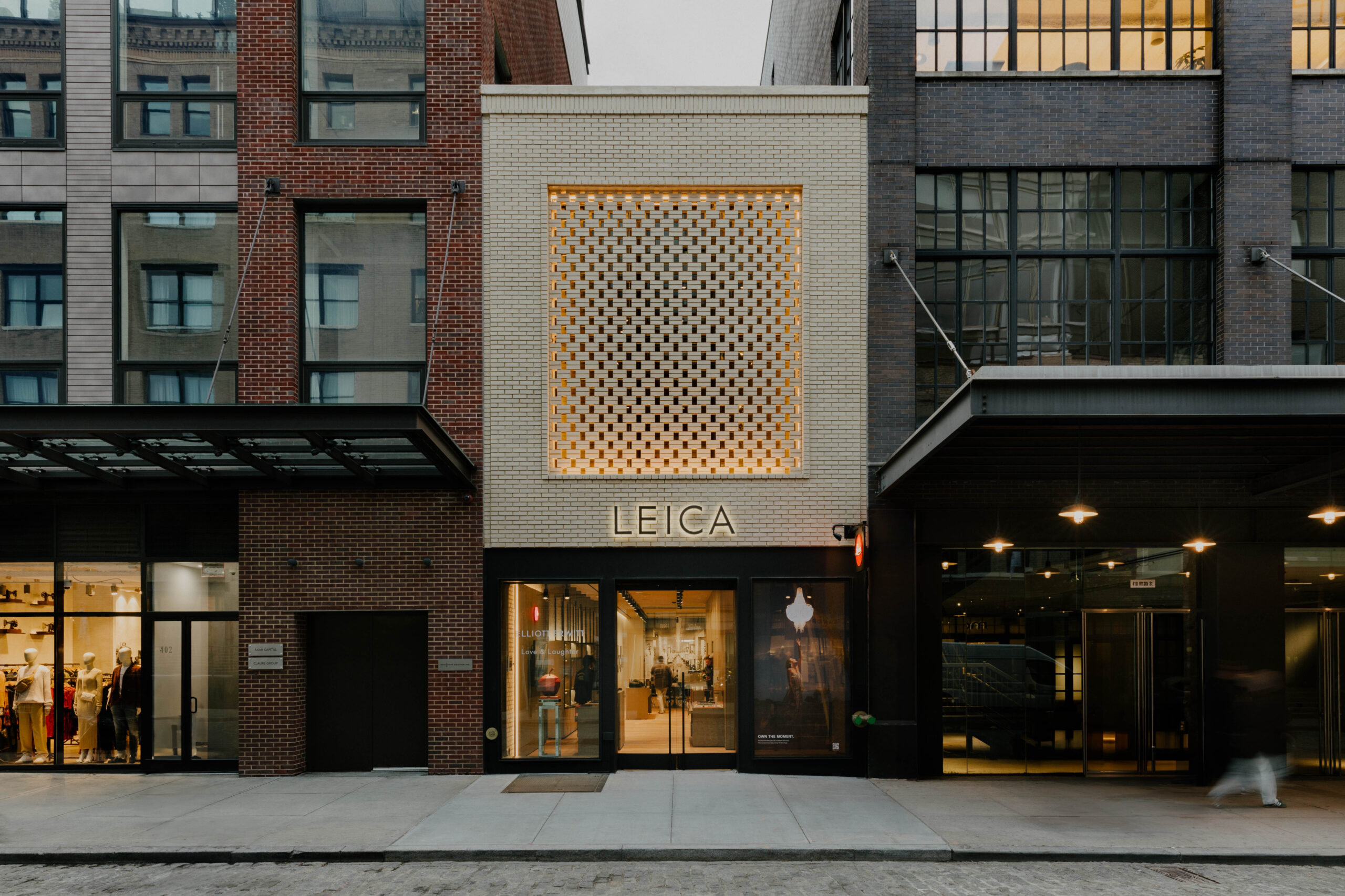
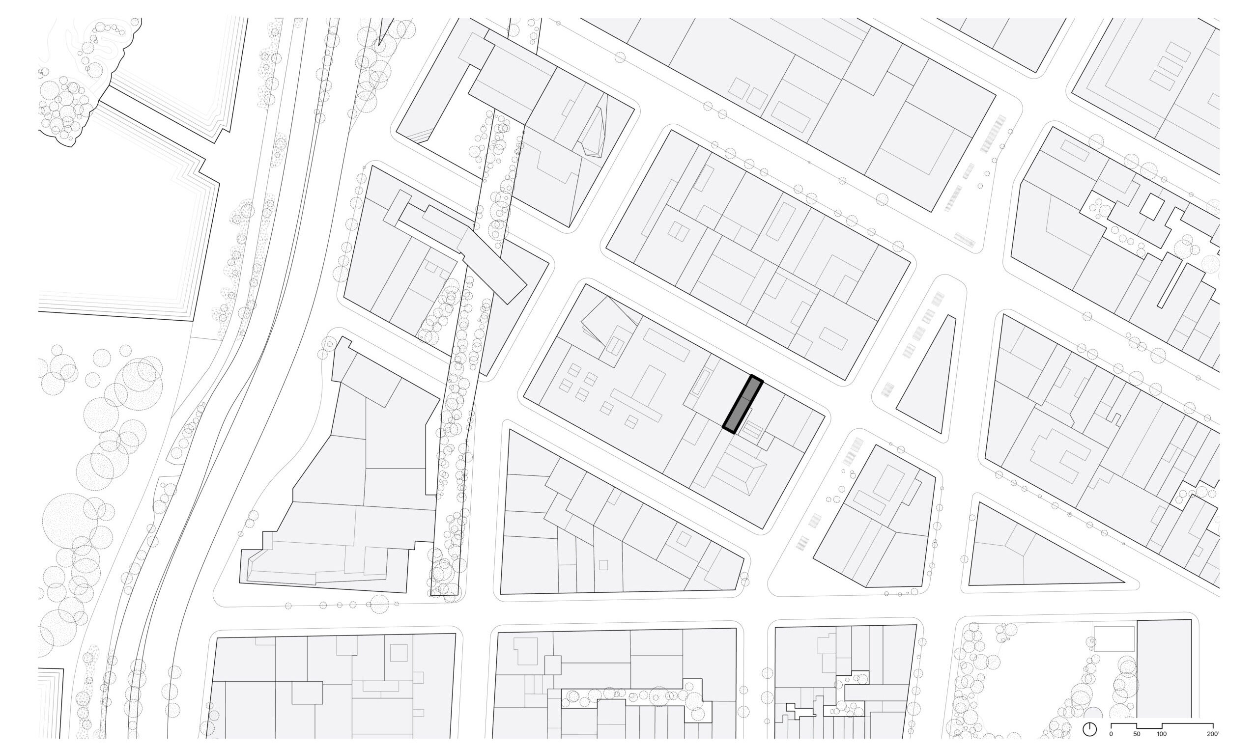
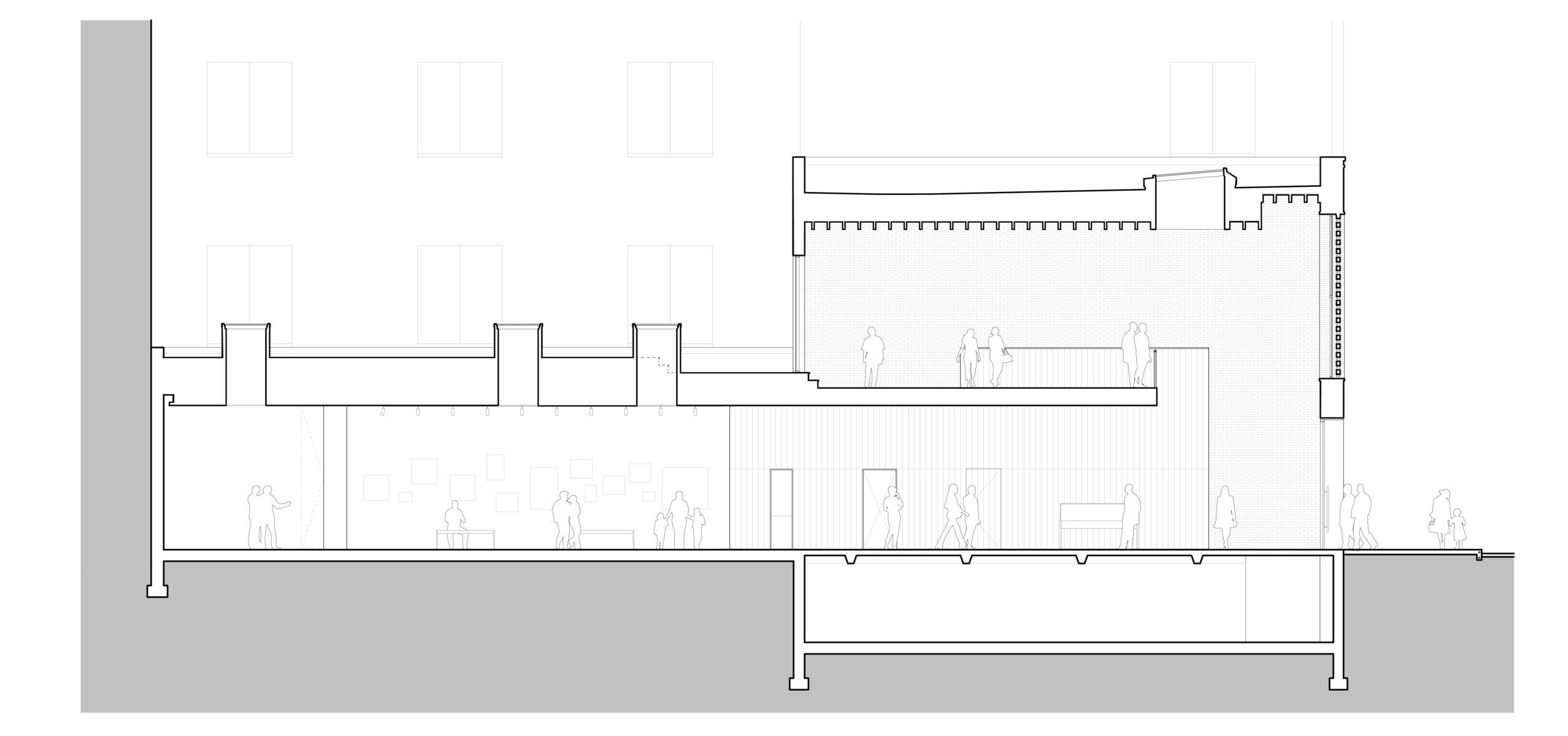
Leica Gallery by Format Architecture Office, Manhattan, New York | From top to bottom: Photo by Nick Glimenakis; site plan, floor plans, and building section.
Unlike the soaring vertical statements of the previous examples, the Leica Gallery makes a bold impression by staying low. At just two stories tall with a narrow frontage under twenty feet between its taller neighbors, it proves that impact isn’t always a matter of height. The Leica Gallery occupies one of the smallest footprints in Manhattan’s Meatpacking District, increasingly dominated by upscale retail and hospitality conversions, demonstrating the potential for adaptive infill reuse. Rather than competing with the surrounding scale, the design embraces the building’s modest proportions and enhances its presence through conspicuous architectural gestures. The redesigned façade references the area’s industrial legacy with a ground-floor steel and glass storefront that highlights transparency, natural light, and retail visibility. Above, a brick screen adds texture and visual interest, filtering daylight and casting a soft light at night to animate the façade.
Inside, the gallery was reimagined to create a spatially rich visitor experience. The removal of part of the second-floor slab and new skylights illuminates artwork on display. The second level opens onto an exterior terrace, extending the visual dialogue between the building and its urban context. Balancing historic sensitivity with contemporary clarity, the Leica Gallery exemplifies how thoughtful design can optimize even the smallest urban footprint, adapting an existing structure for new use while enhancing visibility and connection within a dense and evolving cityscape.
Architects: Want to have your project featured? Showcase your work by uploading projects to Architizer and sign up for our inspirational newsletters.
The post Filling in the Gaps: Infill Architecture at Its Most Inventive appeared first on Journal.