


Color Optional: How Grayscale Became the Default Design Setting

The Extended Entry Deadline for Architizer's 2025 A+Product Awards is Friday, February 21st. Get your brand in front of the AEC industry’s most renowned designers by submitting today.
“Mere color, unspoiled by meaning, and unallied with definite form, can speak to the soul in a thousand different ways.”
Oscar Wilde clearly had some thoughts on shades. Most of us do. But what does today’s distinctly monochrome palette say about where we’ve got to as a species?
Last September, Finnish Architectural Review published its fourth issue of the year. On high-grade paper, it should not have been as daring as it was. Yet even the editorial acknowledged dedicating a magazine to color at a point in history when hues have “all but vanished from an architect’s toolbox” was pretty bold.
The publication is not alone in perceiving a prevailing sense of greyness about the world. In the UK, the Creative Industries Policy and Evidence Centre (Creative PEC) “tracked the color of objects over time and found a substantial rise in the use of grey.” The results, published in 2021, also revealed a significant decline in the prevalence of browns and yellows.
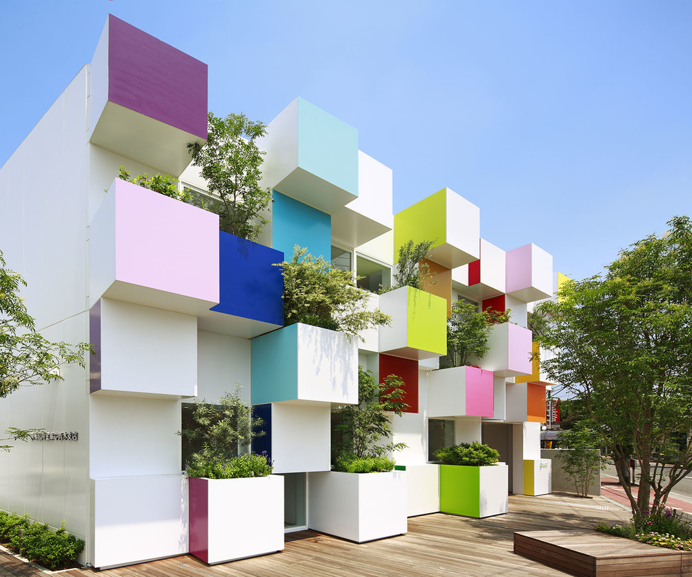
Sugamo Shinkin Bank / Nakaaoki Branch by emmanuelle moureaux architecture + design, Kawaguchi, Japan
The work, led by Britain’s Science Museum Group, examined over 7,000 photographs, identifying the shade of every pixel to create a catalogue of colour. Or lack thereof. Dark charcoal grey was the most common, which — staggeringly — appeared in over 80% of all pictures. The contrast of a wooden telegraph machine from the mid-1800s, ornate communications cabinet rich in reds, yellows and browns, and a late-noughties silver, black and grey iPhone, casts the decline in sharp relief.
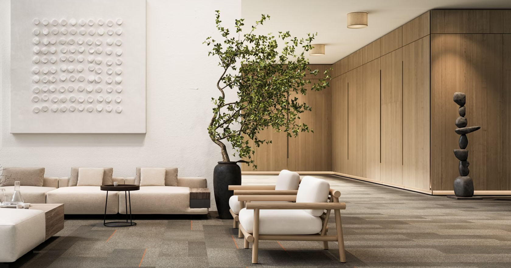
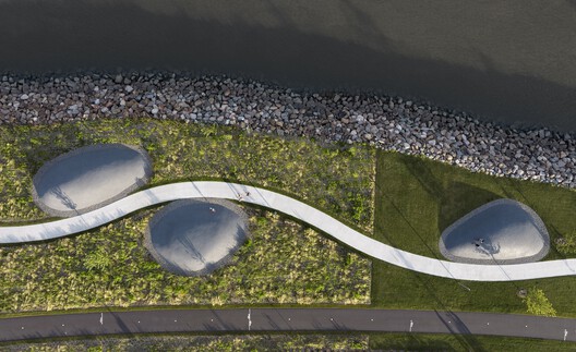
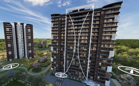
Materials drive design. Or at least feasible design. And this counts for aesthetics as much as things like durability and ergonomics. In the 21st century, we make things from other things which are much less adaptable in terms of color, and, against the infinite rusty hues of trees, way less colorful to begin with. Nevertheless, the slide into greyscale is evident across the board, including products which could easily be toned to exacting specifications. Cars being one. Buildings another.
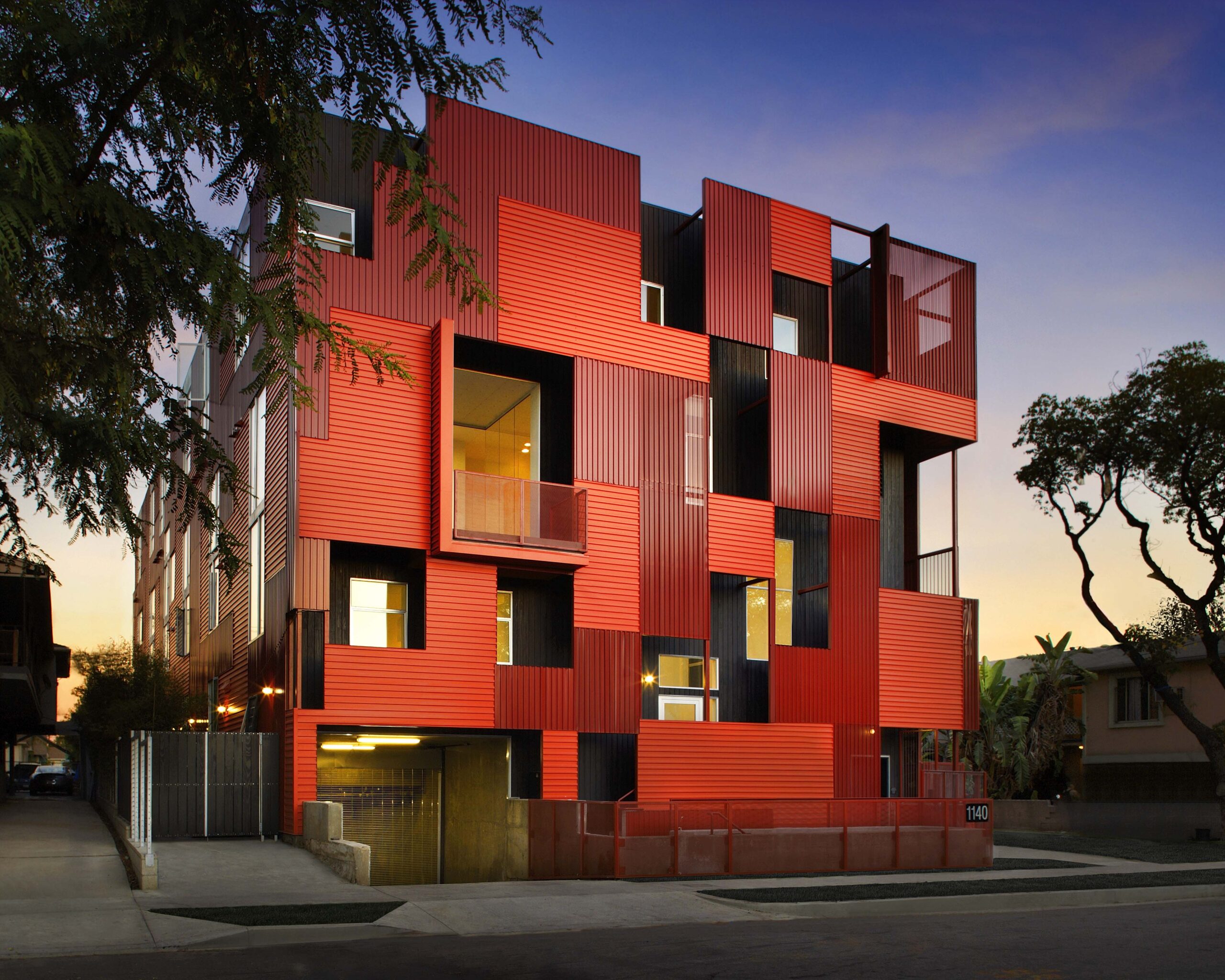
1140 Formosa Ave. by Lorcan O’Herlihy Architects [LOHA], Los Angeles, California
“Colorful backdrops and quirky aesthetics are accumulating millions of likes and saves on social media platforms like Instagram and Pinterest,” she wrote at the time. Given the power of digital networks to make or break governments, let alone inspire design, the apparently-subconscious move to a more monochrome side of life is even more jarring. We’re making things people are not naturally conditioned to notice.
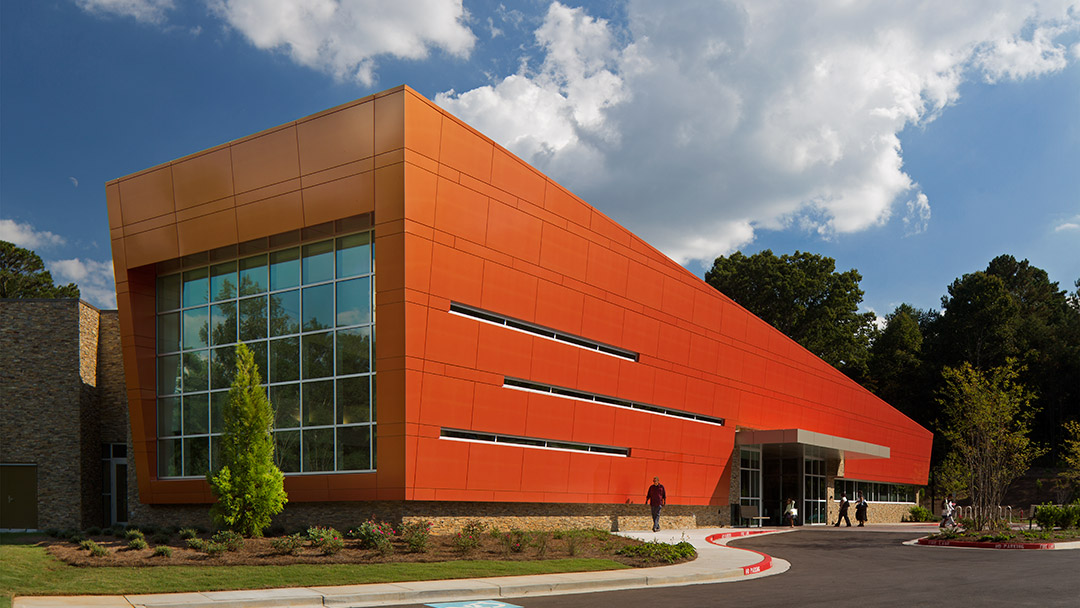
Wolf Creek Library by Leo A Daly, Atlanta, Georgia, an example of bright coil coatings on metal building façades
Writing for PULP, the University of Sydney’s student magazine, Simon Harris threw his hat into the greyness conversation with an op-ed, Greyness. “A pervasive phenomenon in contemporary Sydney buildings,” which is “both vernacular and pedigreed.” The view that architectural conversations consistently fail to talk about the majority of architecture humans interact with daily is omnipresent — our tendency to focus on “capital A” projects by practitioners who “defined the image of Architecture through each age” rather than most buildings.
February’s cover story in The Atlantic, ‘The Anti-Social Century‘, shed some light on modern architectural priorities for the majority of what we build (or what gets built in the publication’s US homeland). For every landmark, there are thousands of off-the-shelf houses finished to meet our needs. Discussing an age of solitude and isolation, where points of connection are rarer and narrower than ever, the feature explained how we’re spending more time at home than any other point in recent history. So homes have become bigger, and we’ve filled them with more to fill the hours we would have spent out in the world.
ARCA Wynwood Design Center by Esrawe Studio, Miami, Florida
According to a US real estate broker quoted in the piece, contemporary house design now reflects this with a demand for television-mountable walls in every room. This ‘necessity’ often comes before fundamentals like the amount of light allowed into a space. It’s thoroughly depressing — rooms are getting darker, save for the flicker of flatscreens showing films and series, which in 2022 led Vox to ask “why do so many TV shows and movies look like they were filmed in a grey wasteland?”
The point being, by taking our eyes off the look of the everyday, by focusing so much on monochrome modern materials, architecture has become the basic design of assets. An idea legitimized by a global housing crisis of our own making and an economic obsession with breakneck growth rather than solution-focused development. The sad fact is, the market demands building are built fast. And that means, for the most part, putting limited effort into designing a scheme because we need to move on to the next. In this environment, uniformity will always be the easiest option. Which isn’t a declaration of architecture’s death, but an admission that urbanscapes are increasingly lacking differentiation. And we’re now so bored of what we see, we want Netflix and Prime at every possible point in our washed out worlds.
The Extended Entry Deadline for Architizer's 2025 A+Product Awards is Friday, February 21st. Get your brand in front of the AEC industry’s most renowned designers by submitting today.
The post Color Optional: How Grayscale Became the Default Design Setting appeared first on Journal.