


Wunder Werkz designs "raw" visual identity for brutalist restaurant Brutø


Design studio Wunder Werkz has designed the visual identity for Brutø, a Michelin Star-winning restaurant in Denver, Colorado, USA that explores Brutalism through food.
The Denver-based design studio, which also redesigned the restaurant's interior, leaned into simple, raw materials, and a utilitarian website that translates the restaurant's intimate setting into a single landing page. It is shortlisted in the Graphic Design category of the 2025 Dezeen Awards.
"Brutalism isn't uncomfortable, it's all about using materials thoughtfully and honestly," Wunder Werkz partner Jon Hartman told Dezeen. "It can be inviting, it can also be thought-provoking."

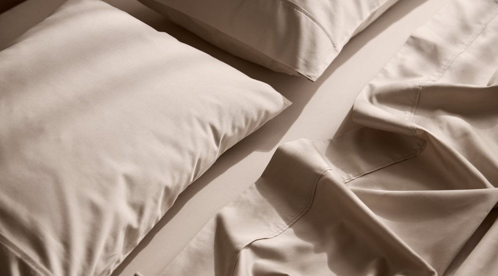
Brutø is an 18-seat restaurant dedicated to sustainability, connection with the environment and the origin of the food.
Even before Wunder Werkz got involved, the restaurant embodied the values of Brutalism by using ingredients like grain and masa "the way a great architect would use concrete to elevate architectural artistry," said Hartman.
"A great brutalist building has no veneer, it is what it is, concrete, wood, steel, raw, crude, blunt," explained Hartman. "The food is the same way, they aren't trying to gussy things up, there is such great beauty in taking things that would otherwise be overlooked, or not utilized and elevating them to something special."

At the restaurant, the menus are printed on post-consumer paper and laid out across a no-frills grid. On the website, the designers broke the norm by overlaying all necessary information onto a single landing page.
"While we always strive for usability, in the case of Brutø, we are eschewing user experience for user experimentation," Liz Henderson, head of web development at Wunder Werkz, told Dezeen.
"So, think of it less as a website and more as a web experiment."

Critical information like opening hours, reservation links, and location coexist with more educational content like the restaurant's manifesto and the team behind the restaurant.
Instead of clicking through to another page to access specific information, you can tick a few boxes at the bottom of the site to clear the rest of the content and only reveal what you're looking for.

"With the web experience we are trying both to imbue the philosophy of brutalism and introduce users to a new experience that, for some, may be jarring at first but also begs you to shift expectations and explore," said Henderson.
The resulting page mimics the "incomplete" look of a brutalist building while paying homage to transparency. A faint architectural blueprint of the restaurant sits in the background, while a concrete breeze block slowly spins in one corner.

Every time you click to tick a box, some information disappears, while an oversized logo that spells out Brutø in the centre morphs into a new typography.
"Brutalism isn't specific to central Europe, but instead appears across Asia, Central and South America, Mexico and Eastern Europe," said Hartman. "We looked to typography that each evoked a sense of global brutalism to us and were able to play with that idea as an introduction moment."
Hartman said the decision to go international mirrors the restaurant's philosophy, where the chefs use a number of international techniques, including binchotan charcoal cooking from Japan, masa and corn techniques that originated in Mexico, and fermentation of koji and gochujang based on Asian techniques.
As the digital extension of the restaurant, the website brings together the studio's visual system under one roof.

Perhaps the most visible motif is the diagonal line that runs across the ø, which the designers have repurposed as one giant, slash-forward-shaped cursor.
The same diagonal line appears on the menu and inside the restaurant, where Wunder Werkz recreated the ø using a T5 construction light and two panes of red acrylic rounds.

"The ø is used as connective tissue across a number of mediums, and we have retranslated it in a number of ways, from font variants on the website to product packaging," says Hartman.
"As a stand-alone object the ø communicates a promise of regeneration and zero waste, culinarily or materially."
The studio recently completed a restaurant's interior design made using "humble" materials, also in Denver.
The imagery is courtesy of Wunder Werkz.
The post Wunder Werkz designs "raw" visual identity for brutalist restaurant Brutø appeared first on Dezeen.