


AS Roma ditches logo for "progressive return" of historic crest
On the eve of its 98th anniversary, Italian football club AS Roma has unveiled an updated logo that hearkens back to its original crest from 1927.
The reworked logo reintroduces the intertwined ASR monogram, which was abandoned during a controversial rebrand in 2013.
Lupa Capitolina – the wolf that nurtures Romulus and Remus in Rome's foundation myth – continues to dominate the upper half of the shield.
![]()
But instead of the grey version of the 2010s, AS Roma has subbed in a more detailed, illustrated version of the motif in the club's traditional Giallorossi red.
"We are also proud to announce the progressive return of the historic ASR crest, a symbol that embodies the soul of this club," AS Roma owners Dan and Ryan Friedkin said in a statement.
"This decision, taken with deep respect for our tradition and in response to the heartfelt wishes of our supporters, is a tribute to Roma's identity. It reflects our belief that the symbols of a club matter, and that honoring our roots is essential to building our future."
![]()
Lupa Capitolina and the ASR acronym featured in the club's first-ever logo from 1927 and both elements have recurred in different configurations over the ensuing decades.
That was until 2013, when the club's new owner, American businessman James Pallotta, ditched the ASR monogram in favour of the word Roma, written in all-caps, alongside the club's founding year.
The move, intended to make the logo more marketable and understandable for an international audience, proved unpopular with many existing fans.
But the Friedkin family, which took over the club in 2020, has now reinstated the monogram with a sweeping, expressive styling reminiscent of a version from 1934.
The new shield features a narrower, pointier silhouette for a more modern look, and a yellow border instead of the harsh black seen in the previous logo.
AS Roma has not specified when the new logo will appear on players' kits, although football publications have speculated it will likely be the 2026-27 season, as the club's leaked 25-26 kits appear to feature the old logo.
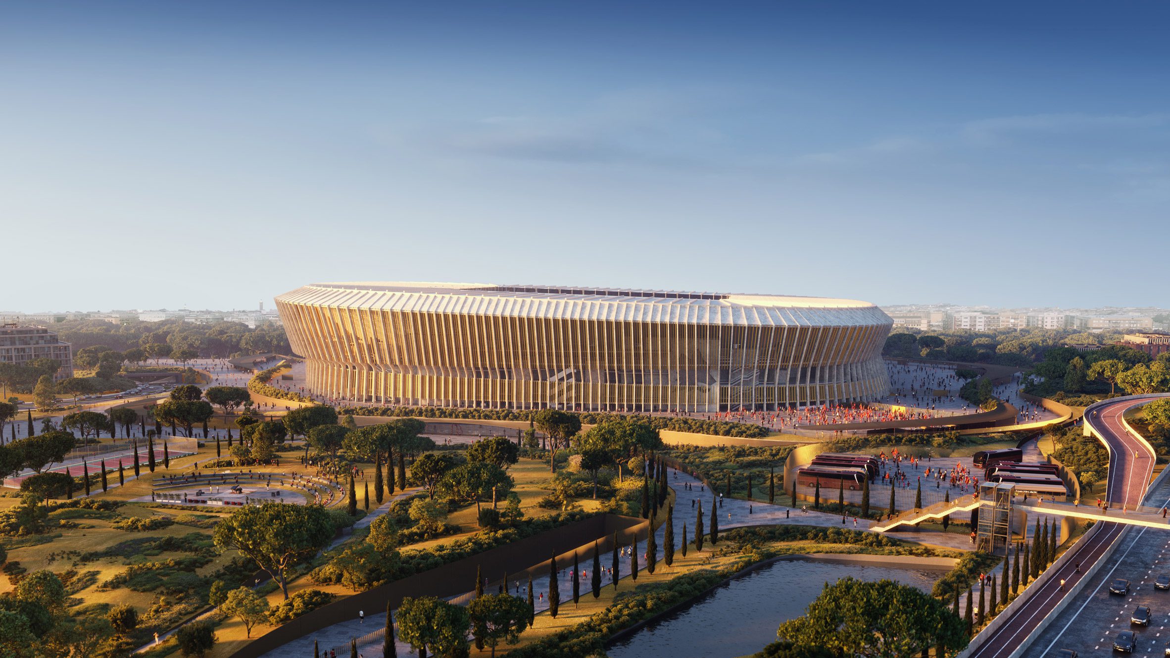
In the lead-up to its centenary, the club is also getting a new stadium in the capital's Pietralata area, courtesy of architecture studio Populous.
The design was informed by classical Roman architecture and will provide the eternal city with "a majestic new colosseum", the Friedkin family said.
All imagery courtesy of AS Roma.
The post AS Roma ditches logo for "progressive return" of historic crest appeared first on Dezeen.