


Burberry rebrand "totally and utterly irresponsible" says Peter Saville

Redesigning Burberry's logo less than five years after its rebrand was a reckless move, graphic designer Peter Saville has told Dezeen.
Saville initially developed a new graphic identity for the British heritage brand in 2018 at the behest of Riccardo Tisci, who was Burberry's chief creative officer at the time.
"Not wise for an organisation of Burberry's scale to forgo continuity"
However, this branding was quickly replaced following the appointment of Burberry's current chief creative officer, Daniel Lee, in 2022.
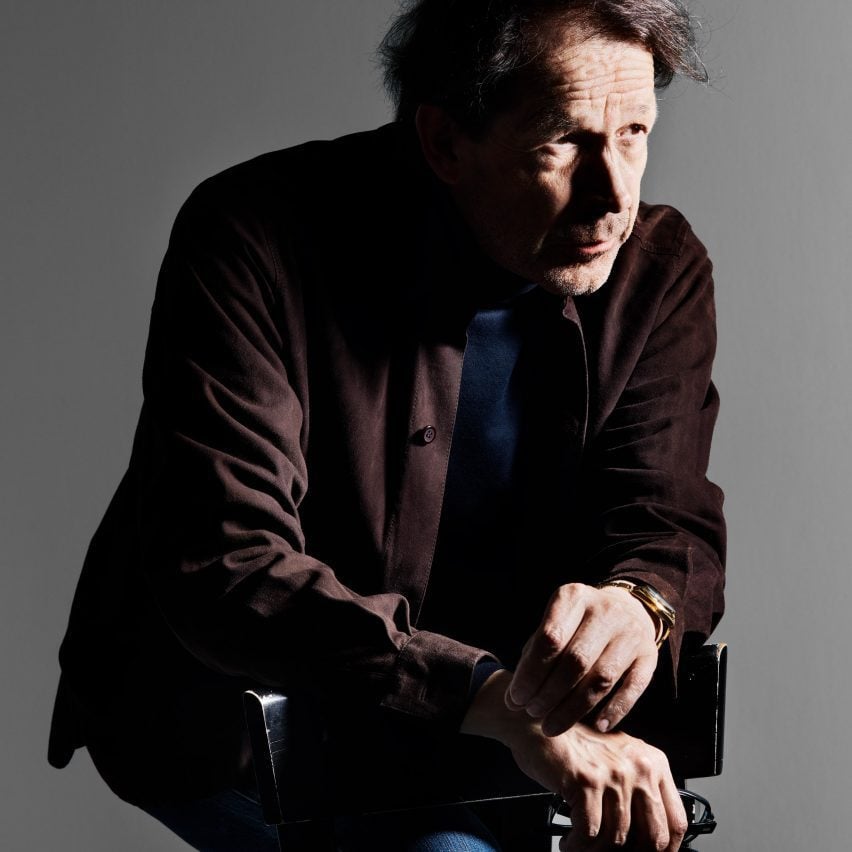
"That, in my opinion, was a management mistake," Saville told Dezeen at the launch of Technicolour, his second collection with Danish textile producer Kvadrat.
"Whether Daniel wanted another logo or not, it was not wise for an organisation of Burberry's scale to forgo continuity."
![]()
At the time the new branding, including a new logo, was introduced, Saville's version had not yet fully rolled out across stores globally, the designer claimed.
"So at any point over the last two years, you could have found at least three different Burberry's circulating in the world," Saville said. "This is totally and utterly irresponsible."
According to Saville, brands should understand the value of consistency when it comes to adapting their established graphic identities.
"At any level of gravitas, brand identity needs to be taken seriously, and the audience in the market needs to be taken seriously," he said. "It's not something to change around like Lego."
"Notion of continuity is fundamental"
Saville referenced the French fashion house Chanel, who he worked with on an album cover for their Métiers d'Art show in 2023, as a brand which upholds the value of continuity.
"No one is allowed anywhere near that Chanel lettering by the Wertheimers," said Saville. "There was an exclusion zone around it. The Wertheimer family understood the equity in that lettering."
"The more successful ones [logos] in the world, by Chanel and Hermes for example, haven't stayed the same but you have not noticed the revolver," he continued. "
"So that notion of continuity is fundamental to what we might identify or relate to, what is called luxury markets."
![]()
Saville, best known for his iconic album art covers such as Joy Division's Unknown Pleasures, developed the 2018 Burberry logo in a sans serif font to replace the Equestrian Knight logo which had been used by the brand since 1901.
"The new logotype is a complete step-change, an identity that taps into the heritage of the company in a way that suggests the twenty-first-century cultural coordinates of what Burberry could be," Saville said at the time of the logo's launch in August 2018.
Latest rebrand "is really nice"
The Equestrian Knight motif was then re-introduced less than five years later with a logo that Burberry announced in their press release to be "archive-inspired."
Although Saville took issue with the timing of the latest Burberry rebrand, he said he appreciated the quality of the redesign by Lee.
"The new bit of Burberry that was done for Daniel is really nice," said Saville. "I like it. It is another way of reading Burberry. There are endless ways of reading Burberry," Saville told Dezeen.
The typeface revealed by Burberry in 2023 reverted to a serif font and referenced wordmarks in use prior to Saville's 2018 graphic identity rebrand.
"There is one reading of Burberry which is utilitarian and san serif and there's another reading of Burberry which is a little bit finer, a little bit more British, a little bit more mid-century. To me, a Burberry trench coat was a utility item and a bold sans was not inappropriate at Burberry," Saville said.
Peter Saville and Kvadrat recently debuted the second iteration of the Technicolour collection, which was first unveiled at Danish design festival 3 Days of Design in 2021.
This second collection showcases a range of 30 new colour ways inspired by the vivid spray markings on flocks of sheep in pastures and is produced entirely in-house at Wooltex's vertically integrated mill in Huddersfield.
The post Burberry rebrand "totally and utterly irresponsible" says Peter Saville appeared first on Dezeen.